Colour distinguishes our brand and helps us create consistent, credible experiences across our products and services.
It is typical for our digital products to be coordinating with communications in other media, such as printed resources, events, campaigns and existing projects. For these reasons colour choices must be well considered in conjunction with our Design and Production Team.
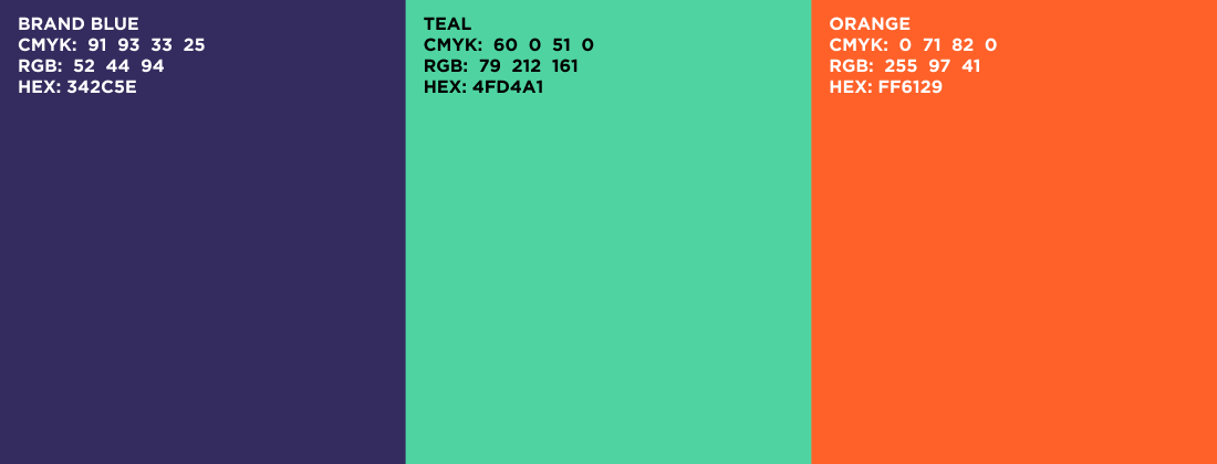
Primary colours
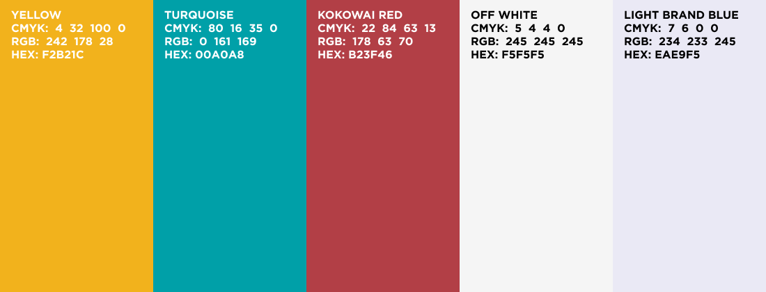
Complimentary colours
Semantic Colours
Semantic colours can help to communicate a message clearly, as well as status such as success, error, failure, reminder, or to invite user interactivity.

In combination with clear text labelling, Interactive/Active Blue is our preferred colour treatment of page elements/controls that the user can interact with, including text links, buttons, filters, menu symbols and so on.
Neutral Colours
Neutral colours form the largest part of the interface, across a product as measured by screen area. In addition to the background, borders, dividing lines; the text content is also normally displayed in neutral colours. The neutral colour definition needs to consider the difference between the dark background and light background while incorporating the WCAG 2.1 standard. Using a pure #00000 black is not recommended in our system as it puts a strain on the eyes, and instead we use deep charcoal greys.
Text
In most circumstances we use neutral colours to display text – either dark text on a light background, or light text on a dark background. This helps us to avoid colour contrast failures when communicating information, and still be able to implement colour coding systems in our products. Consequently, we rely on other on-screen elements rather than text to make products colourful.

1. The light grey #FAFAFA is used as a page background colour in the design system, allowing white to be the distinct background colour of components. 2. The mid grey #6B7280 is an important shade in our system since it is the lightest grey that passes AA colour contrast when used in combination with either white or #FAFAFA.
Colour & Contrast Accessibility
This is an important part to meet the Accessibility criteria. Each user with disabilities will have different needs when it comes to this, so we will give you examples of what good and bad colour choices are and why.
The colour contrast between a text’s foreground colour and background colour can have dramatic repercussions on the legibility of the product. The WCAG states that your text should have at least a 4:5:1 contrast ratio to achieve an AA rating and a 7:1 contrast ratio to achieve an AAA rating.
At the Ministry we focus on the AA rating, because of the wide range of branding and interface types we create.
For more information, please visit: https://govtnz.github.io/web-a11y-guidance/ka/accessible-ux-best-practices/colour-and-contrast/
Latest update
March 2026
Updated brand colours. Removed Te Mahau and Te Poutāhū branding colours.