Our typography is a very important part of our visual identity. Typography refers to the way we present copy in headings and paragraphs, as well as the text of labels and menus.
Typefaces
Gotham
The Ministry’s primary, corporate typeface is the Gotham font family. Gotham does the heavy lifting and 95 percent of text is set using the Gotham screensmart font in different weights, on Ministry websites.
Gotham is a geometric sans-serif typeface with clean, fresh lines that is functional and highly legible, with an unfussy style. It has good readability with a reasonably large x-height. It's qualities have been imitated by lots of other foundries and faces. You'll see Gotham used consistently in Ministry print materials, school resources, and even our signage and wayfinding.
Gotham Screensmart by Hoefller & Co.
Ensure the latin-extended character sets for all fonts are enabled to ensure that macrons are available for use in Te Reo Māori. When Gotham is used, stylistic set 3 must be enabled to activate the ‘single-story’ lowercase ‘a’. This is consistent with our logo and gives Gotham a more distinctive look than the standard lowercase ‘a’.
Do not use any other typefaces without first contacting the Design and Production Team at [email protected]
Heading sizes
WE DO NOT USE THE SAME H1 to H6 for EVERY MINISTRY SITE.
Below we have identified 6 sizes of heading texts that the designer can then choose to be assigned to H1-H6.
Typescale for headings
heading-xxl
font: Gotham screensmart
font-weight: 800
prototyping weight: "black"
font-size: 55px/3.438 Rem
line-height: 66px /4.125 Rem
heading-xl
font: Gotham screensmart
font-weight: 800
prototyping weight: "black"
font-size: 44px/2.75 Rem
line-height: 53px /3.313 Rem
heading-lg
font: Gotham screensmart
font-weight: 800
prototyping weight: "black"
font-size: 35px/2.188 Rem
line-height: 42px/2.625 Rem
heading-md
font: Gotham screensmart
font-weight: 800
prototyping weight: "black"
font-size: 28px/1.75 Rem
line-height: 34px/2.125 Rem
heading-sm
font: Gotham screensmart
font-weight: 800
prototyping weight: "black"
font-size: 22.5/1.406 Rem
line-height: 30px/1.875 Rem
heading-xs
font: Gotham screensmart
font-weight: 700
prototyping weight: "bold"
font-size: 18px/1.125 Rem
line-height: 25px/1.563 Rem
Body Copy
Standard size
The Ministry's digital experiences use Gotham screensmart at font-weight 400 (book) for body-copy, at a size of 1.125 rem (rendered at 18px). This is slightly larger than is often seen in the web (16px is common) but helps us with our readability and accessibility.
font: Gotham screensmart
font-weight: 400
prototyping weight: "book"
font-size: 18px/1.125 Rem
line-height: 30px/ 1.875 Rem
Large size
For use as introduction text for content or quotes - do not use this as the standard body copy.
font: Gotham screensmart
font-weight: 400
prototyping weight: "book"
font-size: 22.5px/1.406 Rem
line-height: 34px / 2.125 Rem
Small size
In situations where the content container is smaller or when moving down to mobile or tablet sizes, use a smaller version of body-copy.
font: Gotham screensmart
font-weight: 400
prototyping weight: "book"
font-size: 16px/1 Rem
CSS line-height: 24px/1.5 Rem
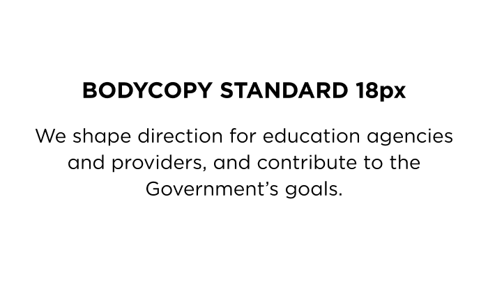
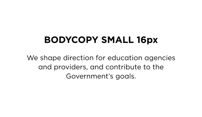
Body copy standard size (left), Body copy small size (right).
Tiny text
At present, we have a couple of common use cases for tiny text. In these cases the text should be designed to avoid wrapping as much as possible:
- text inside small tags or filtering buttons (usually sentence case)
- labelling items in the UI - non interactive things such as a group of controls. (usually, uppercase)
- sometimes overline text uses tiny text (section labels that often appear just above a main heading, usually uppercase)
- Sometimes the site breadcrumb uses tiny text as a space saving measure, when the site features a very deep hierarchy.
- When used in uppercase (which is most often), then letter-spacing must increase.
13px tiny text
font: Gotham screensmart
font-weight: 400
prototyping weight: "book"
font-size: 0.813 rem (is rendered at 13px)
CSS line-height: 1.25 (is rendered at 20px)
CSS letter-spacing 0.03px (0.3px) ONLY WHEN SET IN UPPERCASE. For sentence case, letter spacing = none.
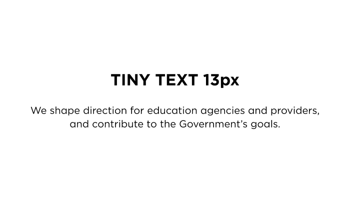
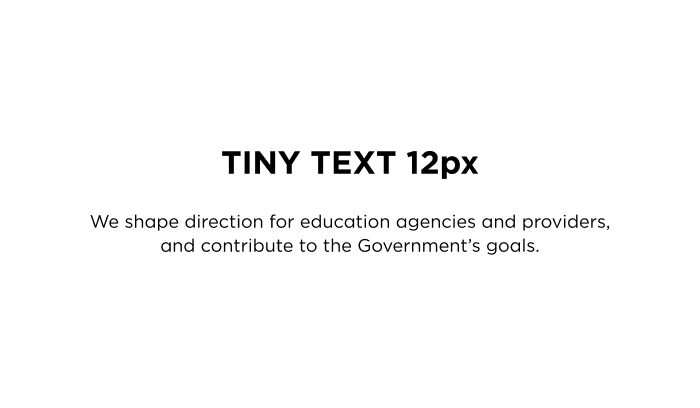
Tiny text at 13 pixels (left). Tiny text at 12px (right).
Limit the line length for comfortable reading
For long passages of text where users are expected to read paragraphs, you must limit the column width (also known as the measure) to facilitate comfortable reading. Do not allow the line-length to extend the full width of screens on larger devices since this is proven to be difficult to read because it is hard for the eye to track back to the left margin and begin the next line. In Design System we restrict long passages of body copy to narrower width containers. Our preference is a container that doesn't exceed 800px.
Larger line-height for body copy
Comfortable reading of larger passages of body copy requires more space between lines. In Design System our preference is a font-size of 18px with a line-height of 1.875. This renders the lines at 30px apart, establishing the vertical rhythm of the page, and provides good spacing to facilitate easy reading.


Body text has been set with line-height too tight (left) which makes reading copy like this difficult. Increase spacing between lines (right) to a value relative to the font-size.
Smaller line-height for headings
Larger text such as headings, do not need as much line-height as paragraphs of body text. This is because larger formatted type, unlike long passages of text, are read as clusters of words and too much space between the lines looks disjointed and inhibits the ability to scan.


A line-height value that is too large and is more suited to body copy has been implemented on the heading (left) creating vertical spacing that is too loose. The correct line-height with a wrapped heading is shown (right), demonstrating how the smaller space between lines creates clusters of words for easy scanning.
Headings are closer to the text below than to the text above
It’s important that headings are more visually connected to the text that they introduce rather than the text of the previous section. In a page of text that uses many headings, this proximity is created by ensuring the space above a heading is larger than the space below it.
Where a passage of text includes headings, the spacing above and below each heading should not be equal (left). The heading should be positioned vertically so that it is closer to the text to which it relates to create a visual connection (right).
Never style text with an underline
In web content the underlining of text conveys a very specific meaning that is expected and well understood – that the text is a call to action and interactive (it can be clicked or tapped). Don't style text that isn't interactive with an underline to add emphasis or any other meaning, since this conflicts with the expected behaviour.
Text alignment
The priority should always be to left-align paragraphs (of left-to-right languages such as English and Te Reo Māori). The exception to this might be the treatment of content examples such as block quotes, callouts, and whakataukī where they are designed to stand apart visually from the surrounding body text. For these examples it can be preferable to centre align the paragraph but only where the content extends to a maximum of about six lines when viewed in a container on a typical desktop device. If there are more lines of text than this or more than one paragraph, reading it becomes difficult and the text alignment should be made left.


(left) shows a short callout centrally aligned paragraph that has been set this way to draw attention from the surrounding page content. If the paragraph example is too long however or extends beyond a single paragraph (right) then the centred alignment is inhibiting comfortable reading and is no longer suitable.
Switching content alignment
Often switching content alignment between a centred layout to a left aligned layout or vice versa creates an awkward, jarring transition. In design system we seek to mitigate this transition by using a change in the background, or a horizontal separator, at the same time. This boundary creates more delineation between the two sections that is more appealing than what can be achieved by text alone.