Icons are a visual method to represent ideas, objects or actions. They are best used at smaller sizes and can help with quickly navigating topics. Below is some guidance to help as a starting point for designing icons for our Projects.
Universal Icons
Our Design System has recently made the change from using the Font Awesome 5.0.8 library of icons to the Material Design 3 icon fonts.
The Material Symbols are a variable set of icons available in a number of styles and weights. For our Design system we have chosen to limit them to a Rounded style, 400 weight and no fill. We also primarily use two optical sizes - 24dp and 48dp.


Customised Icons
Design
Our icons are designed using a pixel-based grid of 24px x 24px and 48px x 48px with all elements of the icon aligning to that grid. We also use keylines to help with consistency of similar objects across the set of icons. Our designs are generally based around basic geometric shapes (rectangles, squares, and circles) as a starting point.
Icons are all designed using 2px and 3px stroke (depending on the scale chosen) and no fill. Rounded corners where required also use a 2px radius. Don't force rounded corners where they don't work visually for the icon. Additonal guidance can be found here: https://m3.material.io/styles/icons/designing-icons
Te Tāhuhu icons are always a solid, single colour. This will predominantly be black, white or our active blue colour - however in cases where another colour is needed, then the icon must follow accessibility guidelines in regards to colour contrast.
Spacing
Icons have 2px padding around the exterior of the base grid. The icon design should not cut into this spacing.
Within the design itself, in most cases there should be a clear 2 pixel space between elements to ensure it is visible at scale.

Document type icons
As part of our alignment to the New Zealand Government web standards, we are required to indicate a document type when the user is going to download a file. Along with having this information in the text, we will often use a document type icon in the download component as a visual way to quickly display this information. Below are some examples of icons we have used, and how we style them.

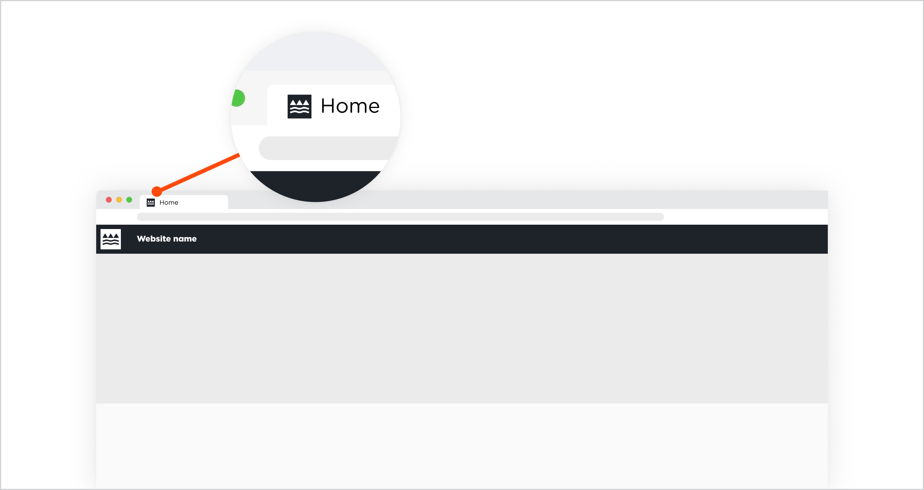
Favicons
Favicons are the visual expression of a brand and product. They are used in the browser tab or, if the product is a mobile app or web app, as an App Icon on your phone. Icons communicate the core idea and intent of a product in a simple, bold, and friendly way. This icon will compete against favicons from other products (e.g. multiple browser tabs are open, looking at your home screen on your phone). All favicons should be unified through concept and execution.
If you have any questions about the application of favicons, please contact our web services team: [email protected]
Latest update
March 2026
Removed information about Te Mahau and Te Poutāhū favicons.