Accordions are controls that allow content to be expanded to help communicate more detail. They appear as a list of headers that reveal or hide additional content, when selected.
Accordions are helpful in scenarios where most users don't need too much detail to get a general understanding of the material, and those users requiring more information can retrieve it conveniently. This component gives users more control over the interface and helps them to digest content relevant to them in stages, rather than all at once. Each list item has a title that indicates the type of content in the related section the user can expect to see once it’s expanded.
Anatomy
The accordion component consists of the following elements:
- Accordion item heading: A clear title for the section of content contained in the accordion.
- Accordion content
- Accordion open and collapse icon: An indication that the accordion is able to be opened to reveal more detail, and also closed if required.

Main elements
Title
- The title should be clear and descriptive of the content, whilst keeping it brief.
- Each title should be wrapped in a heading (h1-h6) that is appropriate for the information architecture of the page.
Body copy
- Content inside of a section may be split into paragraphs.
Behaviour
States
The accordion has two different states: closed and expanded. The icon on the right will indicate to the user whether or not the accordion is expanded or closed. By default, the accordion is closed unless there is a good reason to have the first item of the accordion list opened.
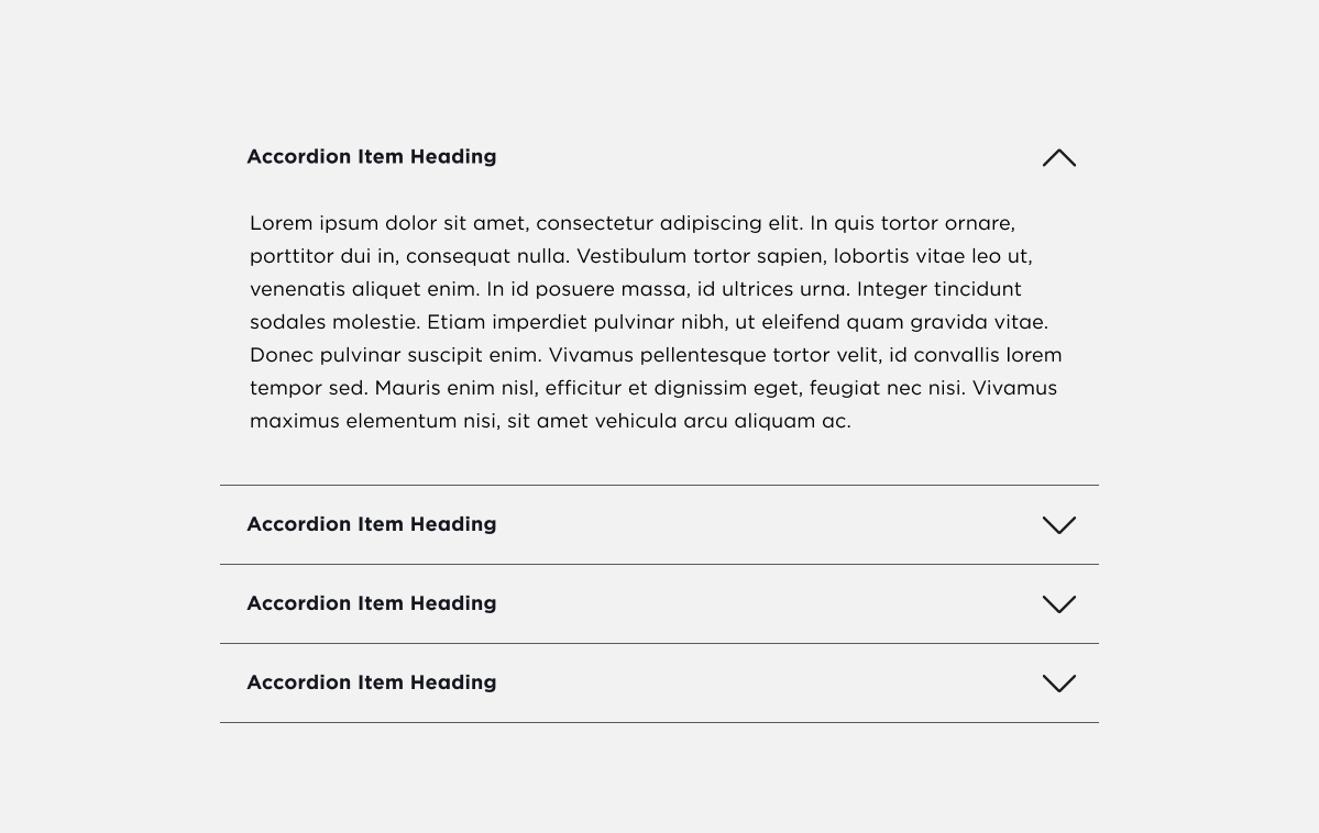
An open accordion is defined by revealing associated content after an interaction. The expand icon is replaced by a close icon.
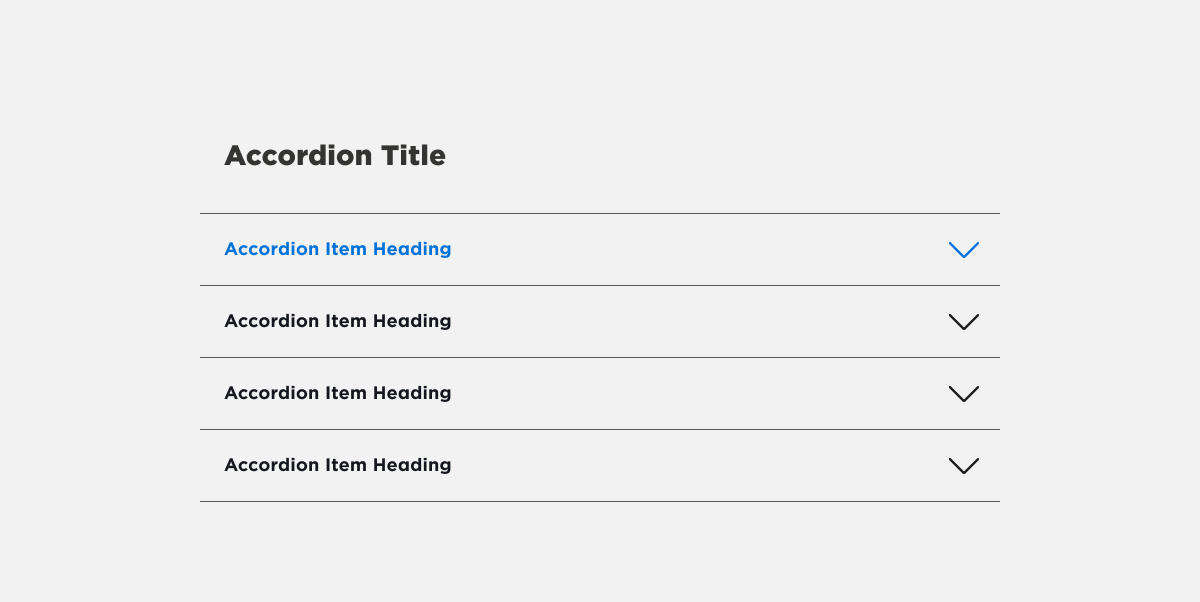
Hover
On hover, the Accordion heading and icon change into the interactive blue colour. This will communicate to the user that that area in the accordion is available for interaction.
Interactions
For accessibility reasons, it is best practice to make the entire item (Heading + icon) clickable, in case the user has limitations with their vision and/or mobility. The user clicks onto the items which will cause the component to activate the expanded state. When the user clicks on the item again (in expanded state) it will return into a closed state.
Best practices
Here are some best practices to keep in mind when designing with the accordion component:
Do:
- Keep the number of panels to a minimum. Too many panels can overwhelm users and make it difficult to navigate.
- Use clear and concise headers for each panel.
- Provide visual feedback when a panel is expanded or collapsed.
- Ensure that the accordion container is visible and accessible at all times.
- Use an accordion to compress long strings of text into manageable blocks.
Don't:
Don't use an accordion if:
- The majority of users require all, or most of the information on the page to get a good understanding. Don't force those users to make unnecessary interactions to read.
- There is not enough text content requiring a treatment to condense it.
- There is too much information (an expanded section is more than the height of several viewports).
- Your only goal is to make a page look shorter.
- Use the accordion component for primary navigation. It is best suited for displaying additional content within a page.
- Content it contains is unrelated to each other. Accordions should represent different sections of related content.
Accessibility Information
When designing with the accordion component, it is important to ensure that it is accessible to all users. Here are some accessibility considerations to keep in mind:
- Use semantic HTML to structure the accordion component. This will ensure that it is properly understood by assistive technologies.
- Provide clear, concise and descriptive headers for each panel.
- Ensure that the expanded panel is clearly indicated, both visually and programmatically.
- Ensure the heading and icon are equally clickable. Asking users to only interact with one or the other could lead to confusion and frustration, and adds difficulty to users with accessibility needs.