Footers can be found at the bottom of the page after users find what they need after scrolling. It is a marker for the user that the page has come to an end and they provide additional information such as links to other pages on the site, email and social media links, and logos for brand identification.
Additional information inside a footer can be compulsory links such as copyright and privacy, licensing, contact information, links to other pages within the website, and email and social media links.
Brand consideration
With the rebrand of the Ministry, we now have a set of footer designs to align to the lead department on the project. Please reach out to [email protected] for access to these designs and to discuss which brand is appropriate.
Design
Structure
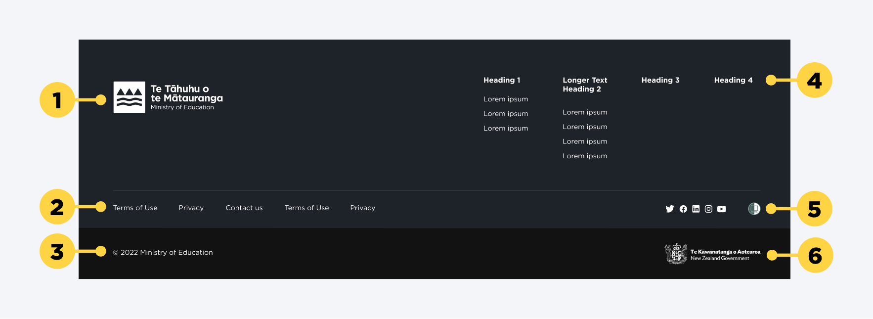
1. Ministry logo
2. Secondary links
3. Copyright information
4. Primary site links
5. Social media & Shielded site icon
6. New Zealand government logo
Main elements
Logos
- The Ministry logo needs to be shown in the top left corner of the footer.
- The New Zealand government logo needs to be displayed separately in the bottom right corner and link to https://www.govt.nz/
Links
- Primary footer links in the top right area of the footer should relate or closely mirror the information architecture on the site.
- Secondary footer links in the left bottom corner should link to our compulsory pages, such as Copyright, Privacy statement, Contact and About this site, as outlined in NZ Goverment Web Usability Standard 1.3.
Social media & Shielded site icons
- These should link to the relevant social media channels of the Ministry of Education.
- The shielded site icon needs to be included to ensure that every user can use the site safely.
Alignment
By default the content inside the footer should align with the 108px left and right margins on 1440px Desktop screens. On a wider desktop monitor (e.g. 1920) those margins are still being honoured for the footer. The rest of the site will adjust to the large desktop margins.
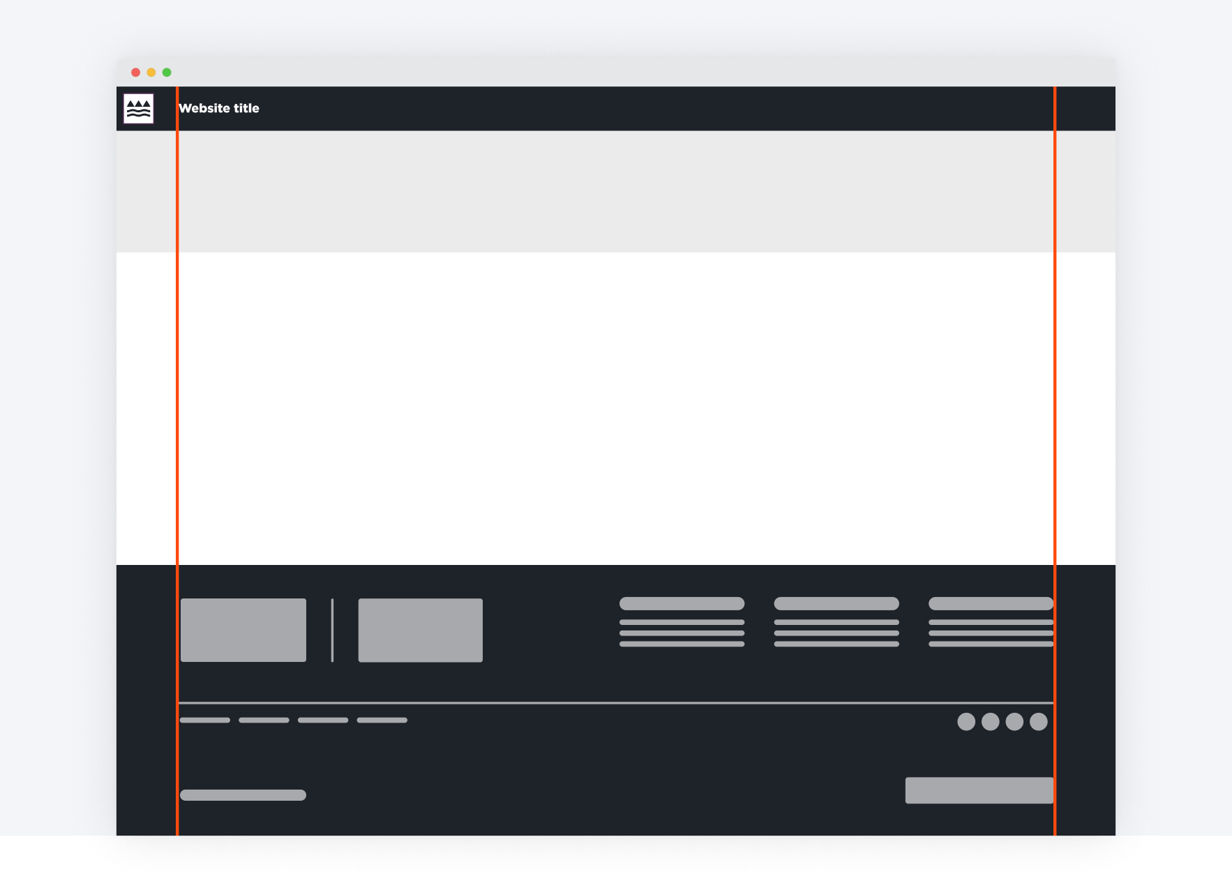
The alignment of the left margin should match with the website title in the header.
Behaviour
States
The footer has a default state. When the user interacts with a link, they get send to the designated pages. The component itself does not expose or hide any elements, therefore the component only has one state.
Hover
On hover, text links inside the footer will receive an underline and the text will change to our interactive blue colour. Any icons will turn interactive blue as well without an underline.
Interactions
For accessibility reasons, the interactive elements inside the footer needs to be reachable via tabbing on the keyboard. This is also important for screen readers as they use the same underlying structure of code to read the links out for the user.
Placement
In-Page Placement
Footers are solely placed at the end of the page. They should not be placed at the top or in the main area of the page where content gets displayed.
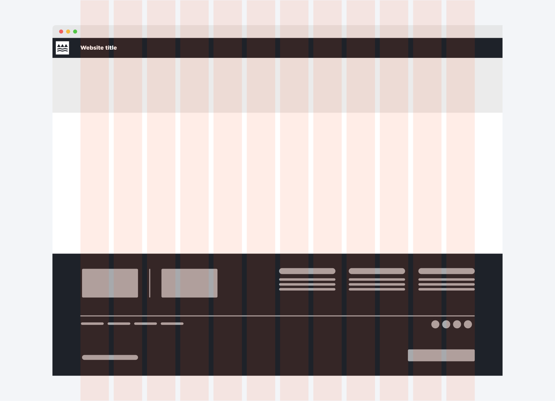
Grid Placement
When placing a footer on the 12 Column Grid, logos on the left and the links on the right-hand side align to the grid columns.
Iconography
The only icons that we use in the footer are the social media icons. This ensures that the use of icons inside this component is kept purely for external linking purposes. We should not use chevrons or similar icons to indicate behaviour where the user can expand or collapse link items.
When to use this component
- Every public facing website or application requires this footer component, and to meet all NZ Government accessibility and usability standards (see below).
- To indicate to the user that the page has ended (it should be used as the very last component).
- The footer needs to be displayed on every page of the site.
- To display links that are not necessarily part of the top navigation (compulsory links, information about current state of the site, such as an updates page).
Usability
- Ensure the links and icons are equally clickable/tappable. Asking users to only interact with one or the other could lead to confusion and frustration, and adds difficulty to users with accessibility needs.
- Give interactive elements enough space on the screen. Asking users to only interact with one or the other could lead to confusion and frustration.
- Each breakpoint should use the correct scaled footer component. For mobile we use the footer component that has been designed for it, for desktop we use the desktop component. This ensures that interactive elements and static information are legible and easily usable on different devices.