Cards are a container-like version of buttons that enable the user to navigate to different areas of the current site, or other sites. They have advantages over smaller buttons or links in that they offer a description and/or graphics that assist a user in choosing whether to interact.
Cards are useful in design because:
- They suit mobile modular website layouts, by providing a large clickable (and tappable) target
- They simplify layout by offering tidy horizontal and vertical stacking
- By virtue of their size, they command attention helping to reinforce important parts of the information architecture.

Design
Structure
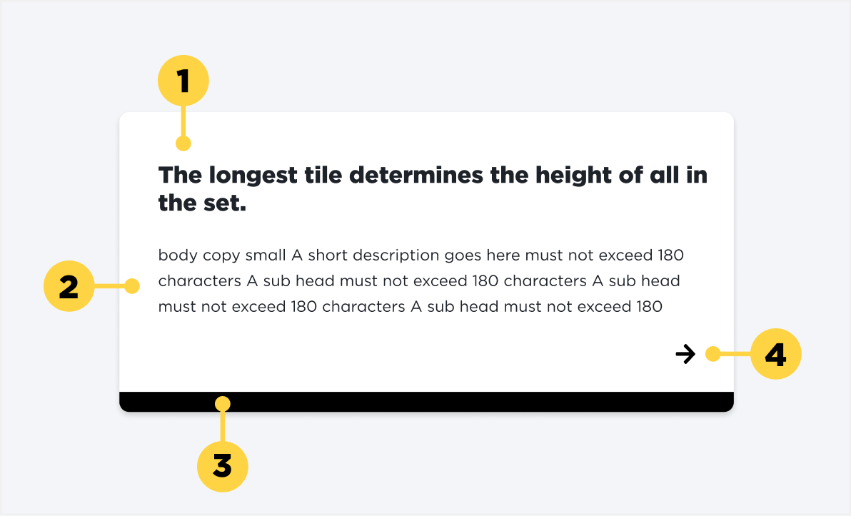
1. Title
2. Description
3. Bottom border
4. Icon
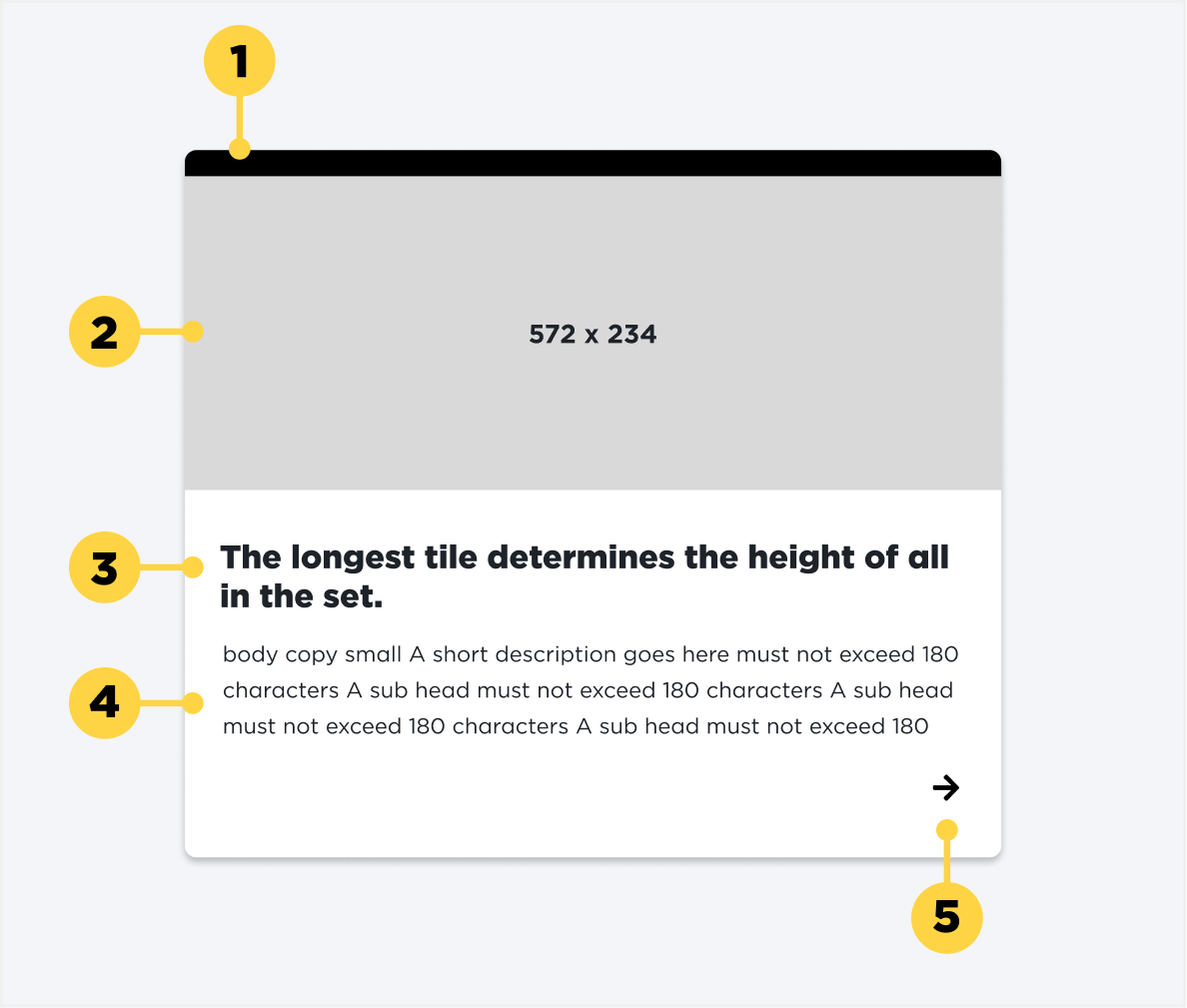
1. Top Border
2. Image
3. Title
4. Description
5. Icon
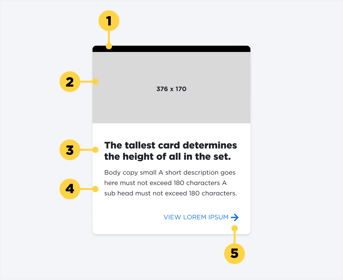
1. Top Border
2. Image
3. Title
4. Description
5. Icon