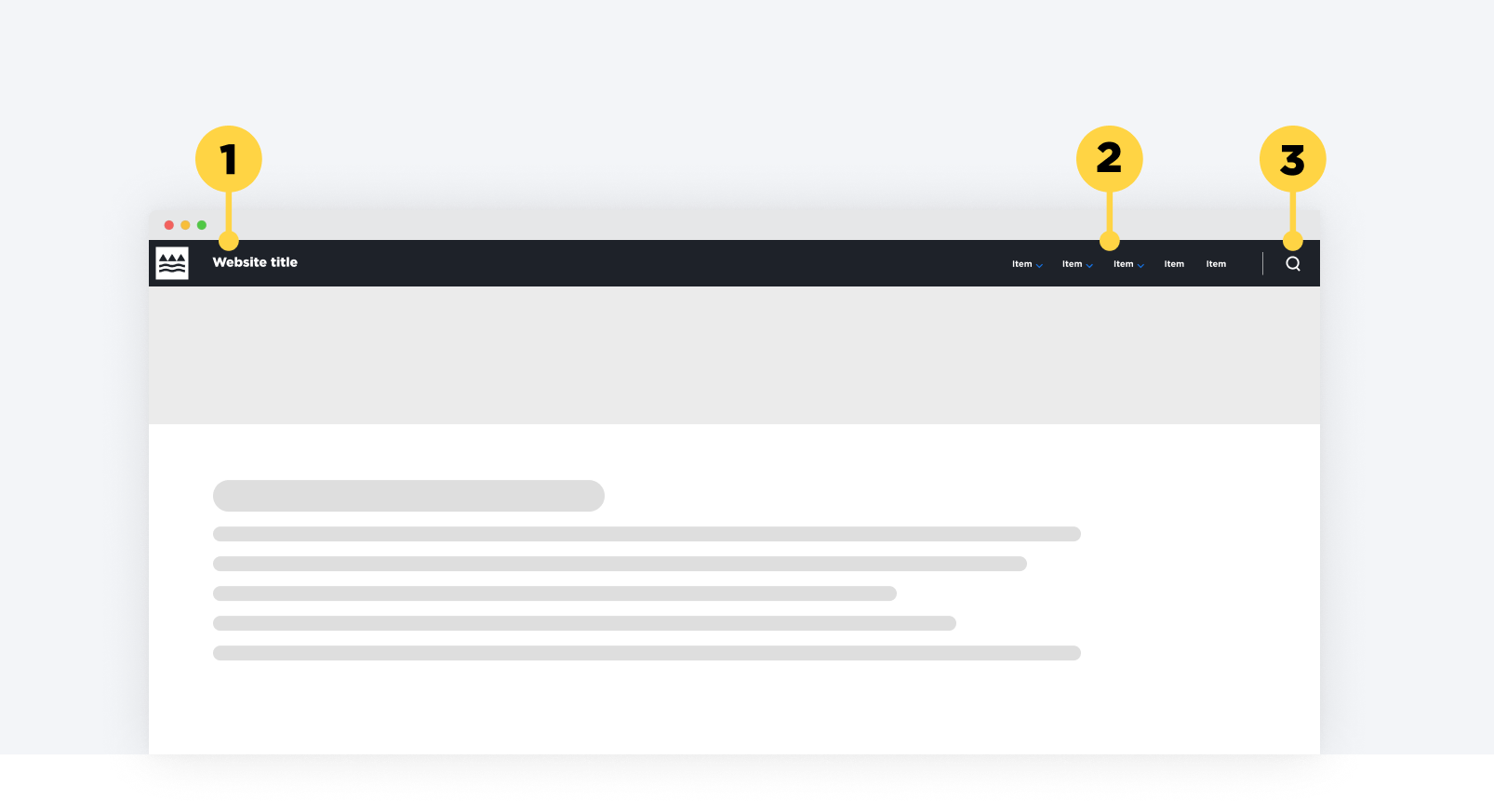
Headers help users identify where they are and what the content of the page is about. They appear at the top of a page, above the main body text.
Usually headers are styled as level (H1) headings and contain the main navigation menu which reveals the Information architecture structure of the site.
Brand consideration
With the rebrand of the Ministry, we now have a set of header designs to align to the lead department on the project. Please reach out to [email protected] for access to these designs and to discuss which brand is appropriate.
Design
Structure
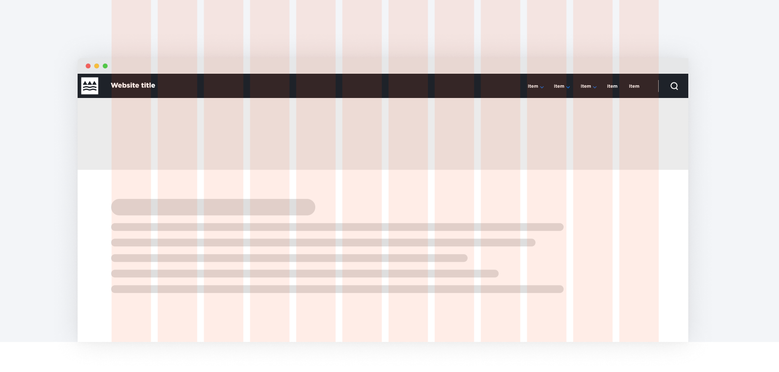
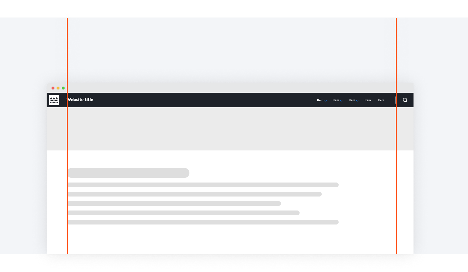
1. Logo
2. Navigation items
3. Search icon (which opens Search)
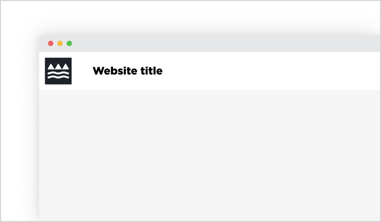
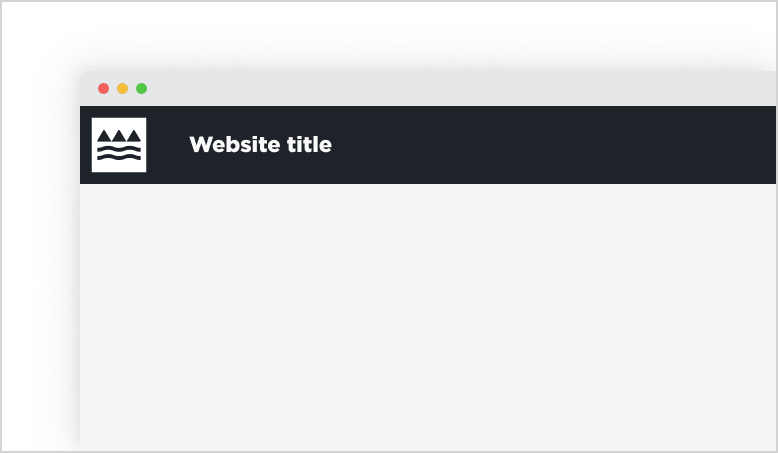
Alternative coloured headers
Depending on the hero banner style, the designer can choose our light or dark version of the header. We usually recommend the light version as a default, but the dark colour can be used if it works better visually with the overall UI style of the product.
Main elements
Logo
- The title should be as clear and descriptive of the content, whilst keeping it brief.
- Each title should be wrapped in a heading (h1-h6) that is appropriate for the information architecture of the page.
- Needs to be a Ministry of Education logo together with a logo typeface that consists of the site name in Gotham.
- Logo typeface is the small-medium heading size (22.5px) on desktop.
Navigation items
- Can either be a direct link, reveal a dropdown or a mega menu.
Search (if required)
- Clicking on this icon will open the Search overlay window.
- Needs to be separated from the navigation items with a divider line. The divider line aligns with the 108px margin.
- It sits centered inside the 108px right margin.
Alignment
The logo type should align with the 108px left margin of the page. The last item of the navigation item list should align with the right margin, with the search icon being situated centered within the margin space.
Placement
In-Page Placement
Headers are always placed as the first element on the page, at the very top and should be consistent across all pages on the website.
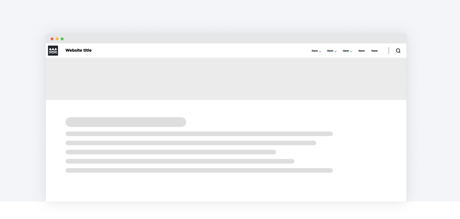
The header placed with a light hero banner at the top of the page.
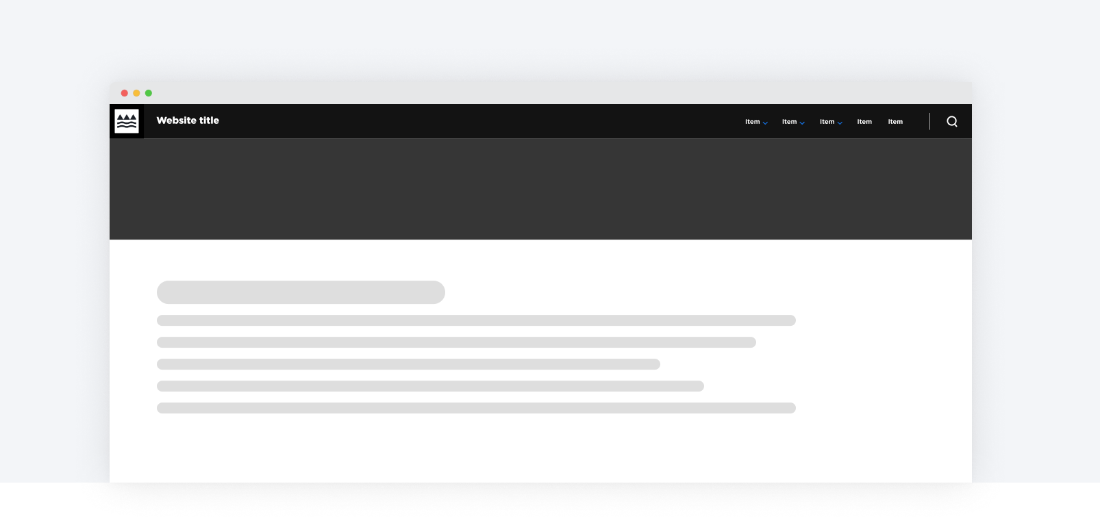
The header placed with a dark hero banner at the top of the page.
Grid Placement
When placing an header on the 12 Column Grid, the site title aligns and the last navigation item aligns to the grid columns.