To play sound we use the browser's in-built audio player. It supports multiple file types.
This component is great for playing music, speech, or any other sound media recording that can be embedded in a page, but it also allows the user to download some sound files to their desktop.
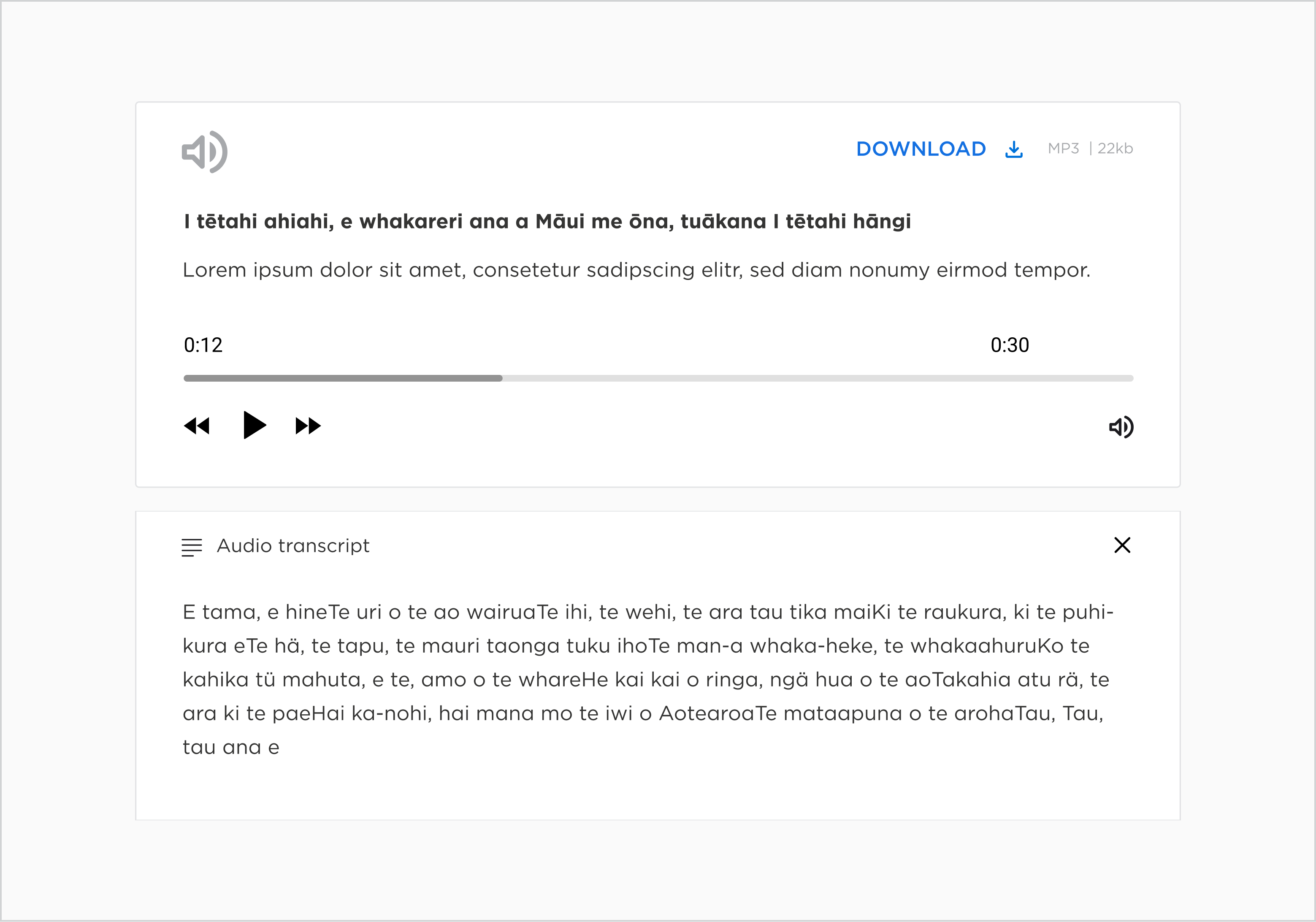
An audio transcript is provided with the component that describes the time-based media in text format for users that are deaf or hard-of-hearing, or users that find it easier to read and process information at their own pace.
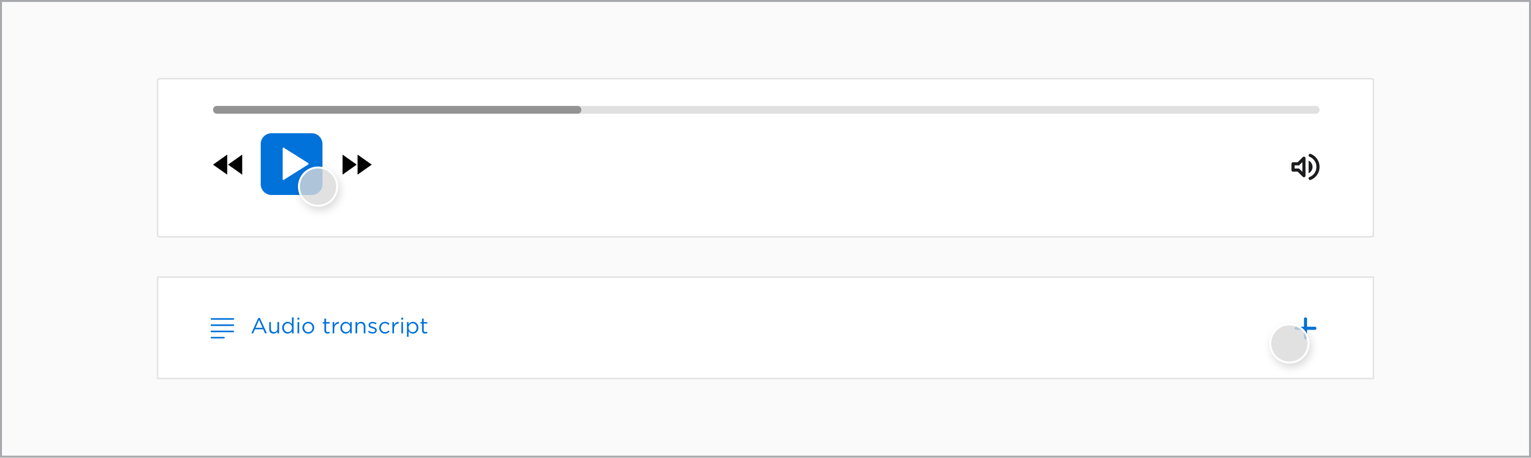
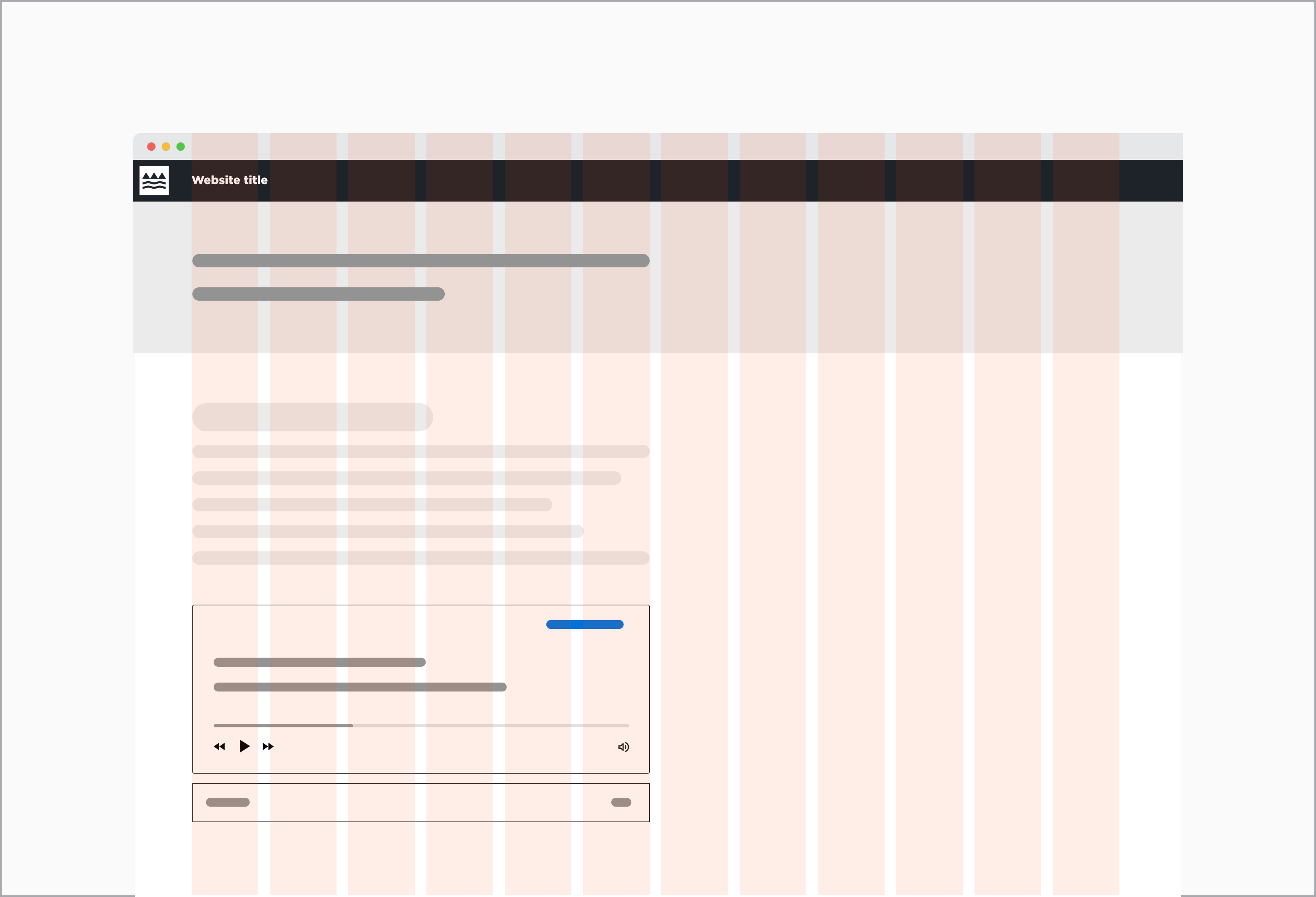
Anatomy
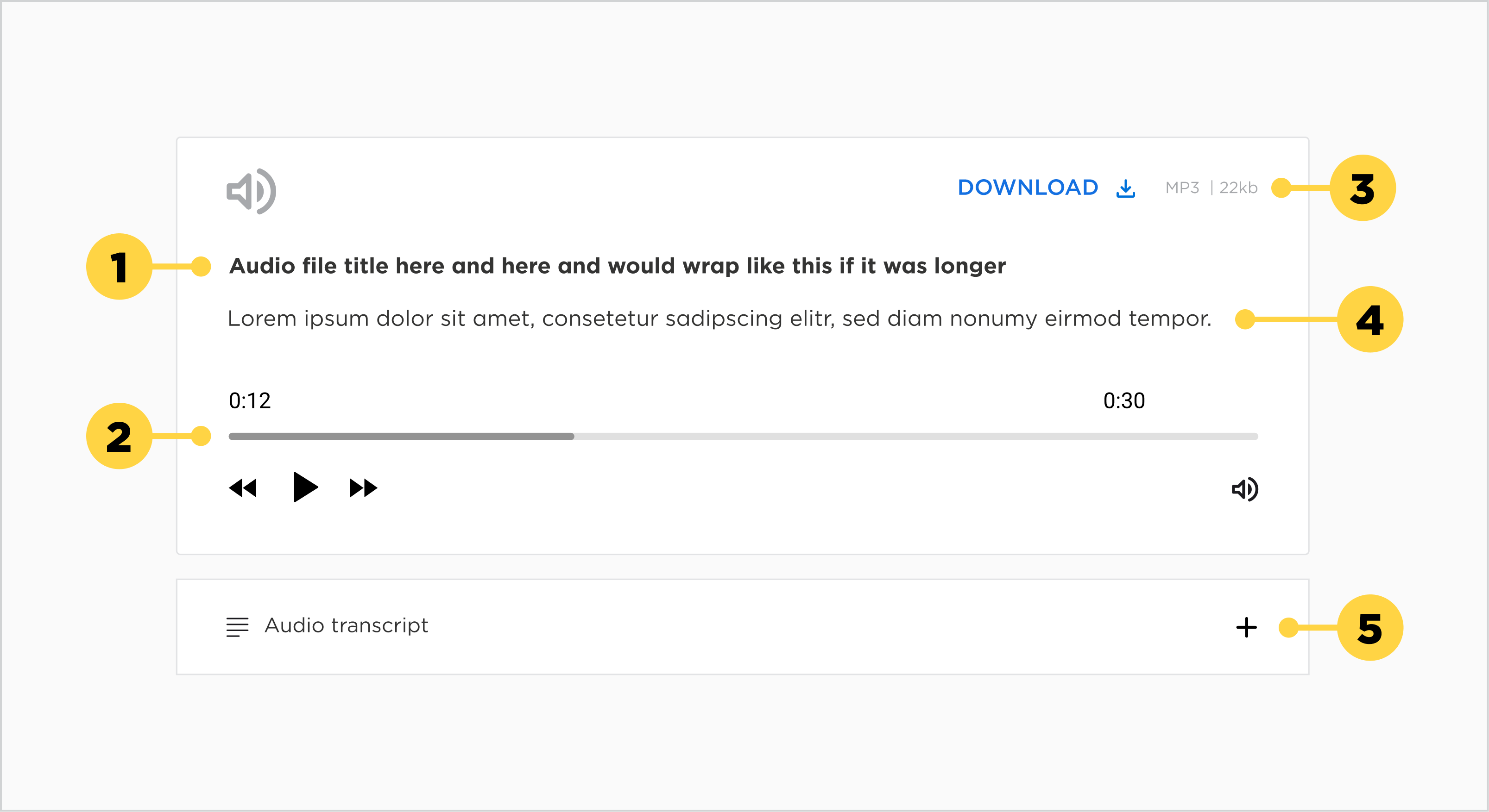
1. Audio Title
2. Controls
3. Download / Open in a new tab in Browser
4. Audio description
5. Audio transcript
Main elements
Title
- The title should be clear and descriptive of the audio file, whilst keeping it brief.
- Each title should be wrapped in a heading (h1-h6) that is appropriate for the information architecture of the page.
Description
- The description should add a bit more context to the title, or alternatively, state the author of the audio file.
Download button
- The file will be opened in a new browser tab.
Transcript
- The transcript should display the content that is being heard on the audio file in text format.
Alignment
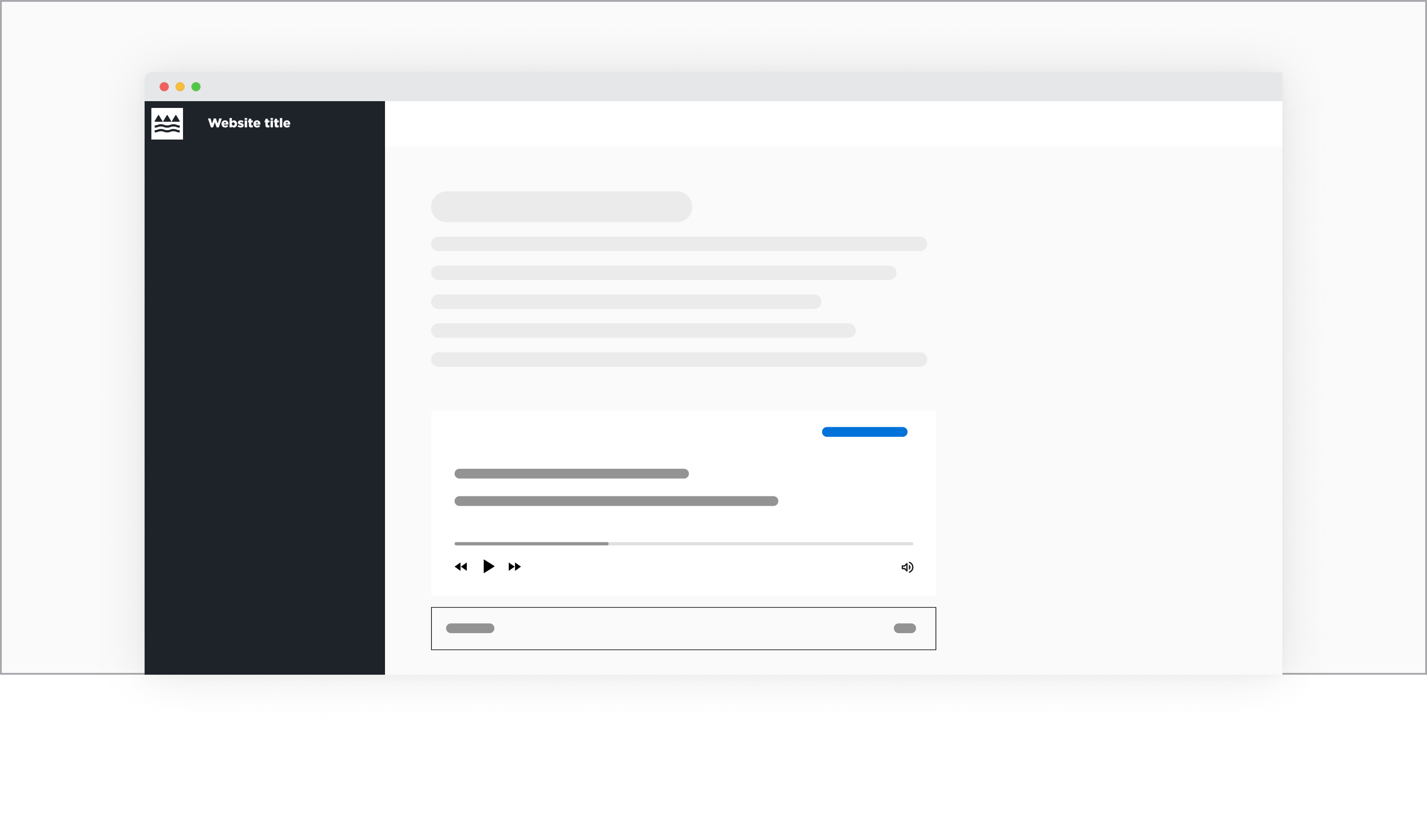
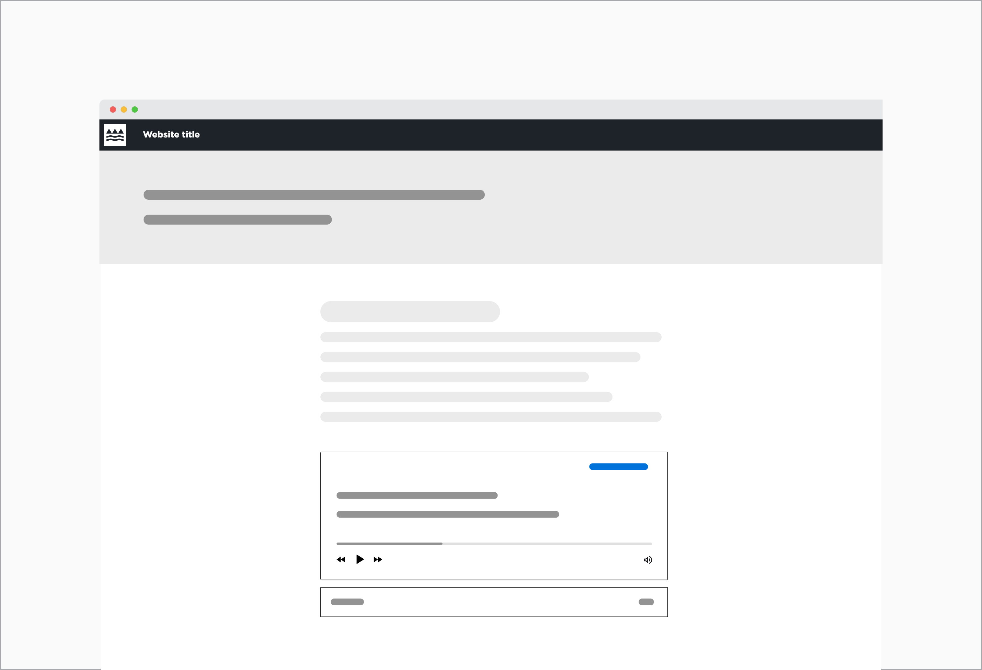
The Audio player will most likely be situated within other content (e.g. text copy, other component). Therefore it needs to be placed in the same content container as the rest of the related content. However, it is not ideal to place the component into a narrow column.
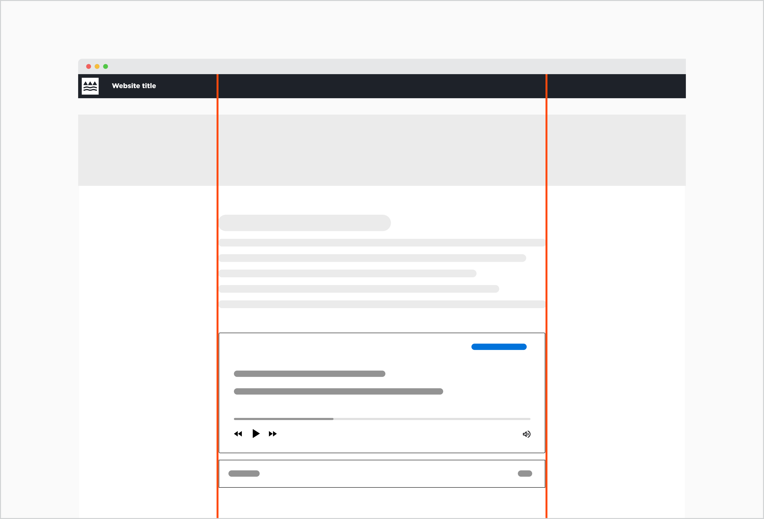
The Audio player is aligned in the centre of the page.
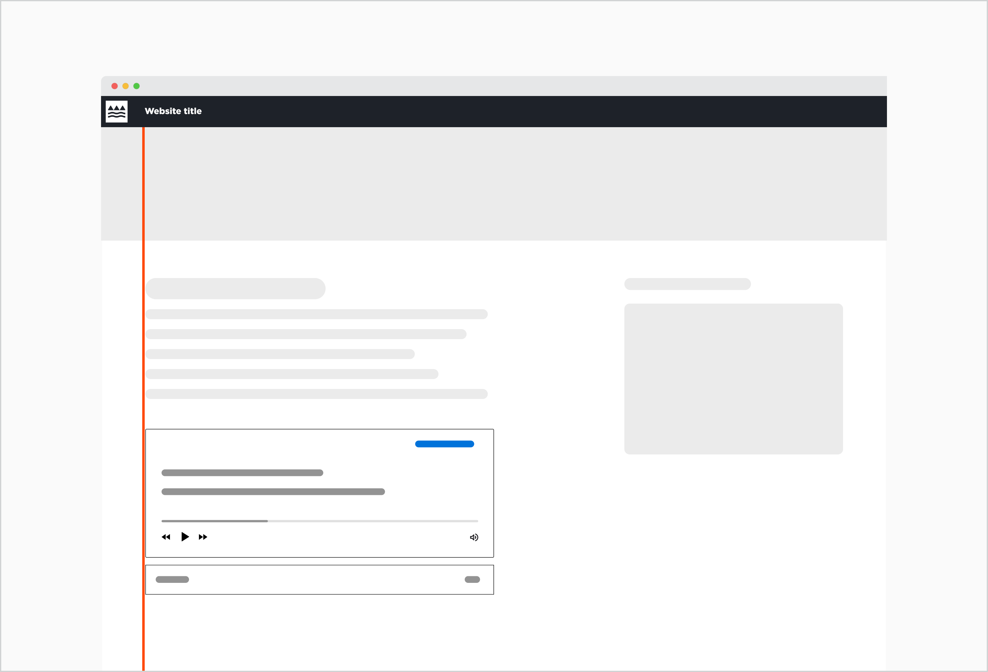
The Audio player is left-aligned due to a two-column layout.
Behaviour
States
The audio component has two states. The default state is the audio component where the user can interact with the controls and the download button.
The second state includes the tab that contains the transcript, a necessary addition for meeting accessibility standards.
Interactions
In the default state, the audio player controls, download button, and transcript tab are elements the user can interact with. The download button inherits the text button hover.
The audio transcript functionality has a collective hover state across the transcript icon, title, and plus icon. The combination of these elements helps provide a large click area for the transcript dropdown, and the plus icon follows on the similar theme and function of our Accordion type dropdown.
The download button, player controls and transcript tab are elements the user can interact with.
Placement
In-Page Placement
Audio components live within the standard content container on the page. Whether or not it is centre or left-aligned depends on the layout that was chosen for the website. It should naturally follow or be embedded within the surrounding content.
Audio component placed within a layout with sidebar
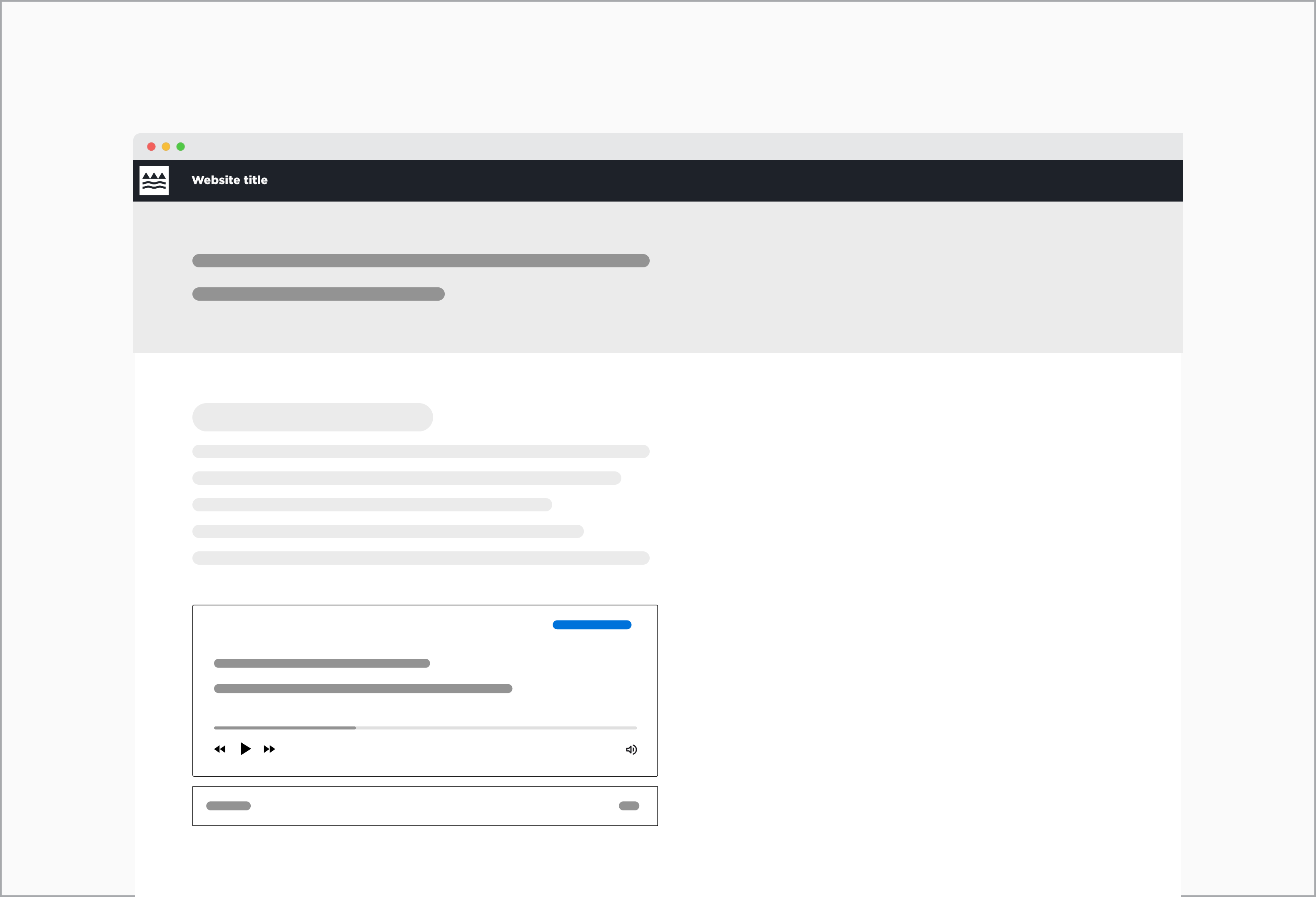
Audio component placed within a 12 column grid
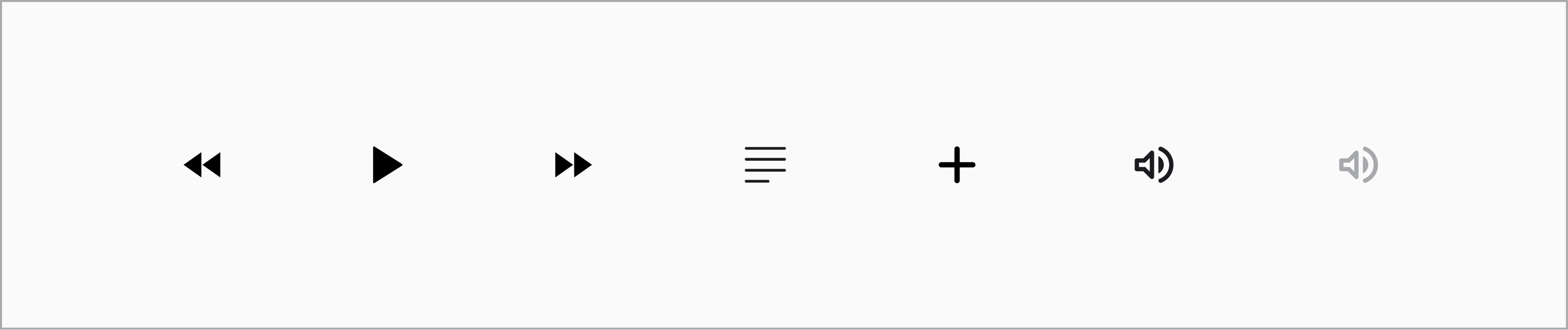
Iconography
A audio speaker icon in the top left corner (not interactive) helps a user quickly identify the function of the component. It acts as a visual identifier rather than a functional icon.
The player control and the download icon are functional icons, which are interactive and communicate to the user how they can use the component. In the case of the audio component there is the rewind, fast-forward, play, pause, and volume icon.
Along with this, a transcript icon, indicating lines of text, adds symbolism to the function of the component.
When to use this component
Use this component if all of the following conditions are met:
- The content is captured within an audio file, but does not contain any moving imagery (e.g. music, podcasts).
- The component is situated within body copy or other methods of content, so that the user is not forced to listen to audio (providing choice).
When to consider a different solution:
Don't use an audio player if:
- The user needs visual cues to understand what is said in the audio.
- The audio track is too long and there is a high risk the user abandons the component and seeks a faster method to get the information.
Usability
Ensure the entire transcript tab is clickable. Asking users to only with the label and icons could lead to confusion and frustration, and adds difficulty to users with accessibility needs.
Give interactive elements enough space on the screen. Especially on smaller devices it is important to have enough space between the interactive elements to prevent the user from clicking/tapping on the wrong area.
Ensure the interactive elements are promptly responsive. If there is lagging or the elements don't respond in a timely manner, it can lead to confusion and frustration. This is especially the case if the user is trying to replay a certain area on the audio track.