Some web content is best provided to users as a file download so that it prints accurately, can be used while offline, or so that the format of complex information is retained.
Our file download component supports multiple file types and comes in two variations. Both provide useful information to the user about the file before they commit to downloading.
Single download
In our Design System we display more than just the filename of a download. We provide an easily recognisable symbol of the file type (icon), a content loaded title that is not the same as the filename, and a content loaded description to help users distinguish the download or to communicate its relevance and importance. Always try to make the download title unique, and do not repeat the title wording in the description.
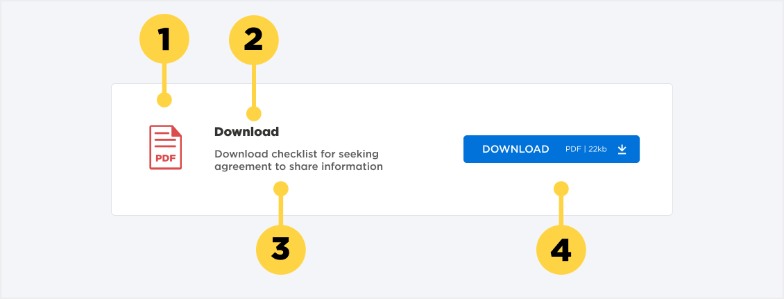
1. File type icon
2. Title. Try to make this title unique.
3. File description. Expands upon the title. Doesn't need to be unique.
4. Download button (with file type and size details).
Multi download
In some scenarios many files are needed to communicate a complete topic, such as a help document that is split into downloadable chapters, for example. The files can be thought of collectively as a set that have some attribute(s) in common. We use the title of each file to communicate their differences.
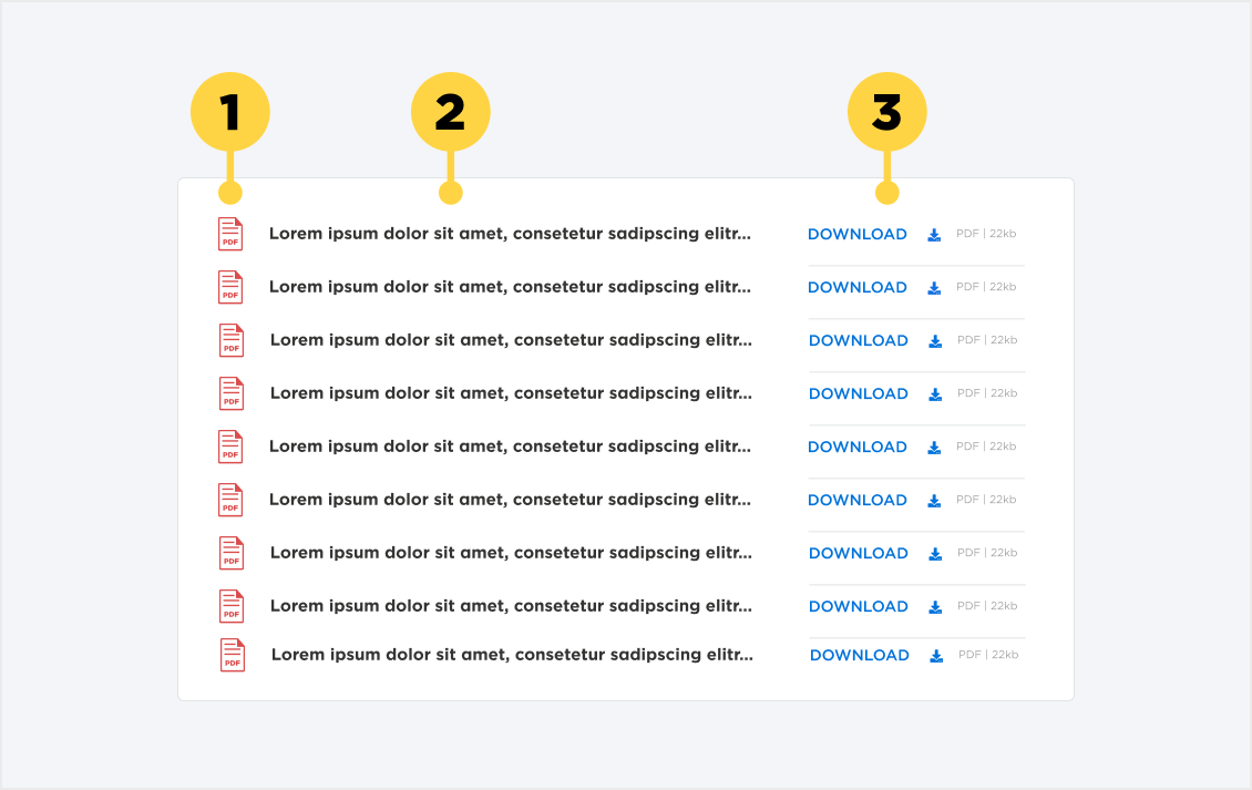
1. File type Icon
2. Title. Try to make this unique.
3. Separator Line
4. Download button (with file type and size details).
Alignment
Both the single and multi-file download components fill 100% of the container width.
Placement
In-Page Placement
Both the Single and Multi Download components will sit within standard content pages.
On some occasions, the Single Download component may also be found embedded within the Step by Step component. The design stays the same overall outside of a minor width adjustment.
Iconography
The download components use a set of File type icons that change based on the file type that is selected for download. Currently, the component has icons for PDF’s, Word documents, Excel files and PowerPoint slides.
There is also a small download icon that visually highlights the function of the component.
Guidance
When to use this component
Single-file Download:
- Highlight a single file of importance to it's context
- Supply the user with extra information that doesn't fit into a content page
- Provide templates of information that are formated in their preferred file type
Multi-file Download:
- Group together a set of related files
- Save space on a page instead of using multiple Single-file components
When to consider a different component
The priority should always be to create HTML content, so that it is accessible and useful to the widest audience. Downloadable files compromise this accessibility so should only be used when it is vital that the content prints accurately, can be used while offline, or the format of complex information needs to be retained to convey meaning.
If the content in question doesn't meet these prerequisites, then simple text and image components should be used to display the content, instead of requiring the user to download another format filetype.