The Image Block is a versatile component that can be used in various contexts to enhance content and create engaging content for our audiences. The Image Block component in the design system has three main types: Default, Image with full text description and full screen image with a background overlay.
Anatomy
The Image Block component consists of several key elements:
- Image: The main visual element of the component, which displays the image.
- Text description: A container that holds text elements such as captions or a description.
- Description block: Appearing underneath the image and holds the description text and file download information.
- File download icon (Optional): Allowing the user to easily download the image to their desktop if required.
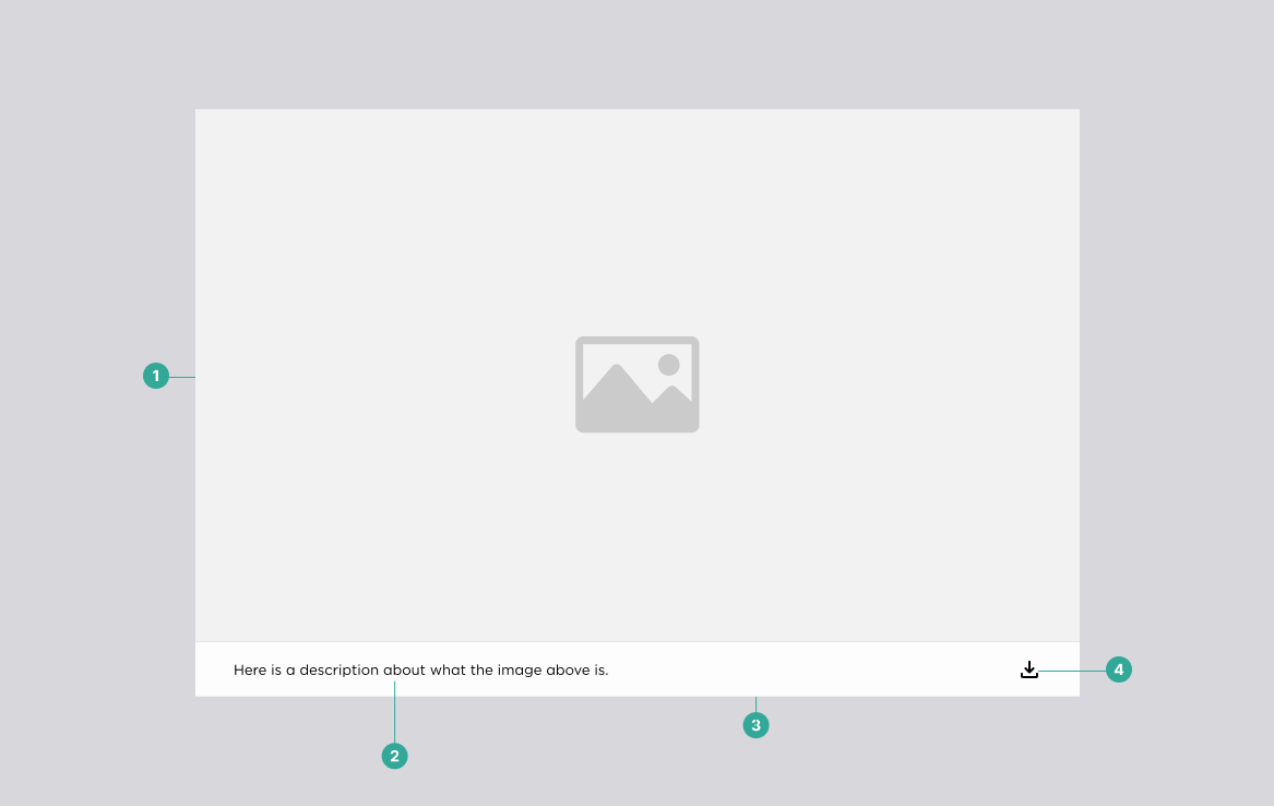
Basic image component anatomy.
Types
The Image Block component in our design system has three main types:
- Default: The default status displays only the image and description text, along with the download icon.
- Image with full text description: This version displays the image with a full expandable caption or description text beneath it if the image is complex or a diagram.
- Full screen: This allows the user to scale up the image to fullscreen with a background overlay.
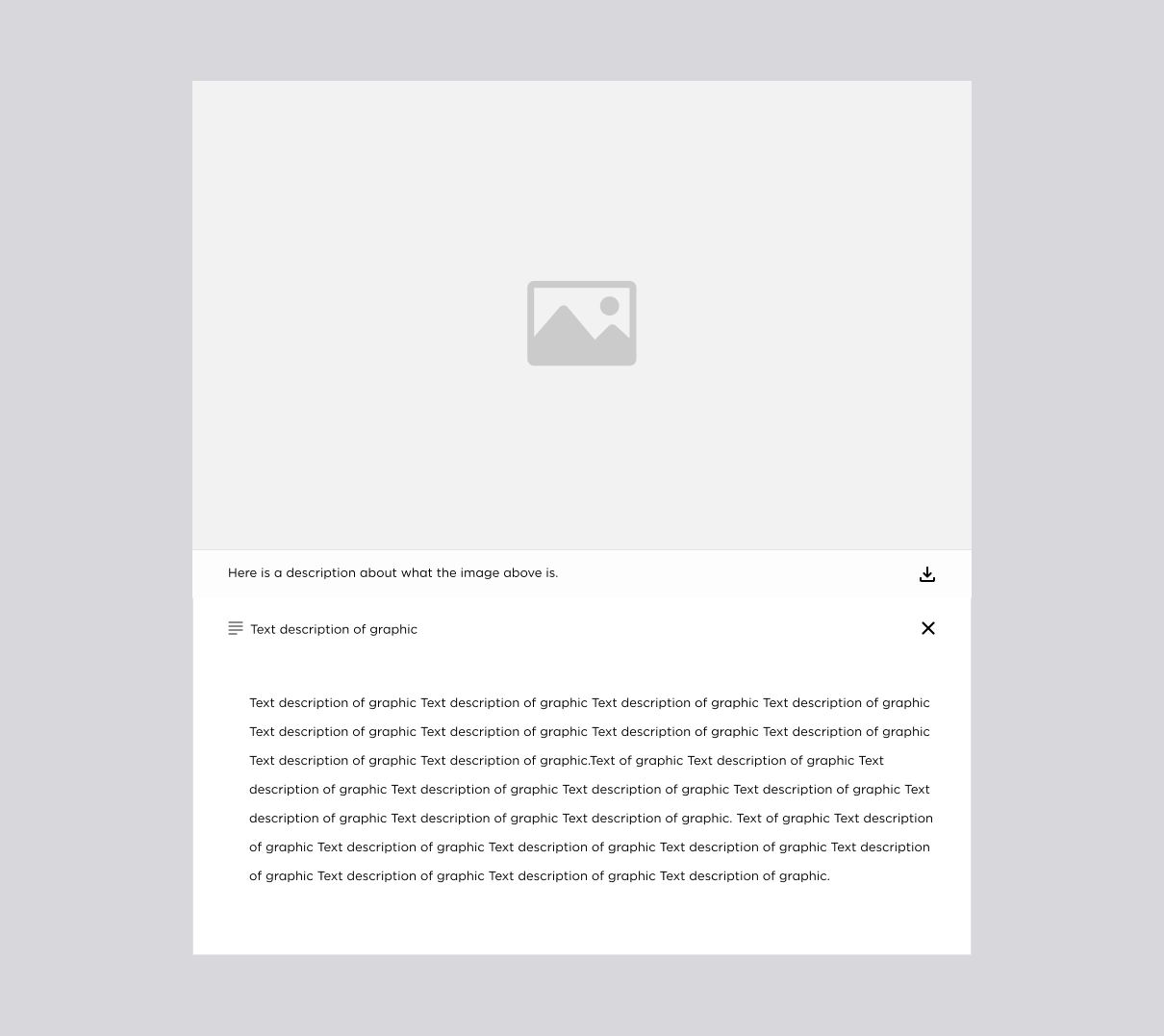
Image component with expanded text

Full screen image component with background overlay.
Best Practices
Here are some best practices to follow when working with the Image Block component:
Do:
- Use high-quality images that are optimised for web and mobile devices.
- Use consistent image sizes and aspect ratios to create a harmonious visual layout.
- Provide clear and concise text or descriptions that add value to the image content.
- Use overlays and other visual effects sparingly, to avoid overwhelming or distracting users.
Don't:
- Use images that are copyrighted or otherwise restricted without proper permission or licensing.
- Use images that are low quality or blurry, as they will detract from the overall user experience.
- Use overly complicated text or descriptions that will require excessive scrolling or reading.
Accessibility Information
When using the Image Block component, it is important to consider accessibility guidelines to ensure that all users can access the content. Here are some accessibility considerations to keep in mind:
- Provide alternative text descriptions for images to ensure that they are accessible to users with vision impairments or who use assistive technology.
- Use colour contrast to ensure that text and overlays are readable for users with visual impairments.
- For more information on the NZ Government Web guidance on images, visit https://govtnz.github.io/web-a11y-guidance/wct/images/index.html