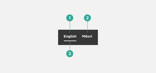
The language toggle component is a UI element used to switch between different languages in a multi-lingual interface. It allows users to easily switch between different languages without having to navigate to a separate page. For our product, we have 2 use cases for where the toggle would appear. Firstly, it could be a local or page specific toggle - this means it could be for a single page or for elements on the page (for example a whakataukī). Secondly, it could be a site wide, global language change - and would always appear above the header navigation.
Anatomy
Local
The local language toggle component consists of the following elements:
- Inactive label
- Inactive language text
- Active label
- Active language text

Global
The global language toggle component consists of the following elements:
- Active language text
- Inactive language text
- Active language indicator

Type - Local
We use the local language toggle for page specific content - for example it could be a single page translation or sections on the page itself that can be translated. The placement of this component is dependant on the content itself.


Examples of the local language toggle with Māori (left) and English (right) activated.
Types - Global
We place our global language toggle component in a prominent and consistent location throughout the interface - in most cases this is above the header navigation in the top right corner. This is a common location for global UI elements and can help users quickly locate the language toggle component.


Examples of the global language toggle with English (left) and Māori (right) activated.
Accessibility Information
When designing with the language toggle component, it is important to ensure that it is accessible to all users. Here are some accessibility considerations to keep in mind:
- Use semantic HTML to structure the language toggle component. This will ensure that it is properly understood by assistive technologies.
- Ensure that the language selector is keyboard accessible.
- Provide clear and concise labels for each language.