
Alert banners are used to notify users of important information or changes on a page. They can be applied site-wide or based on the page the alert is related to.
Additionally they are used in a way that attracts the user's attention without interrupting the user's task. They can be applied site-wide or based on the page the alert is related to. To reduce information overload, the alert banners should only be used if absolutely necessary and no more than one banner per page.
Design
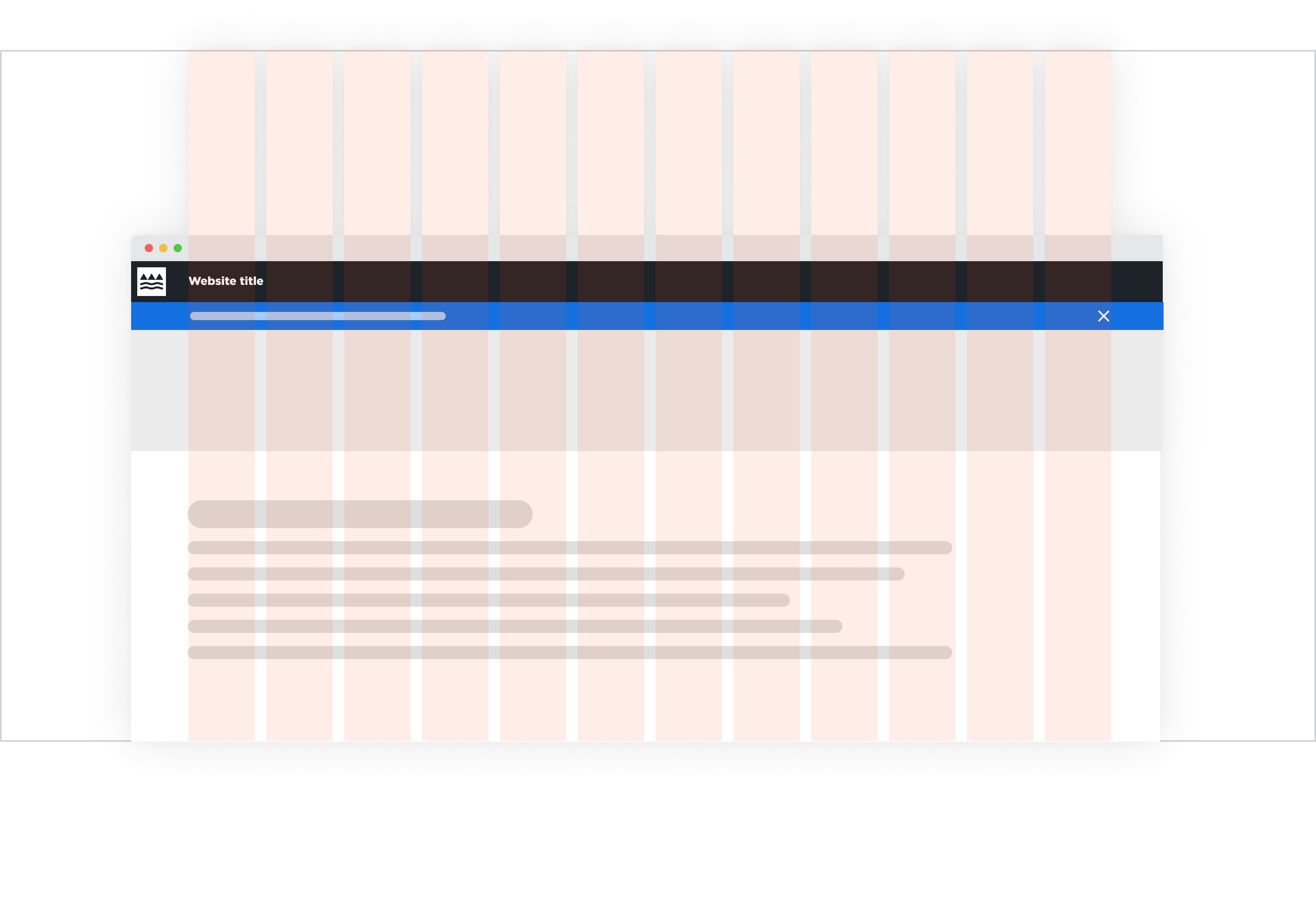
Structure
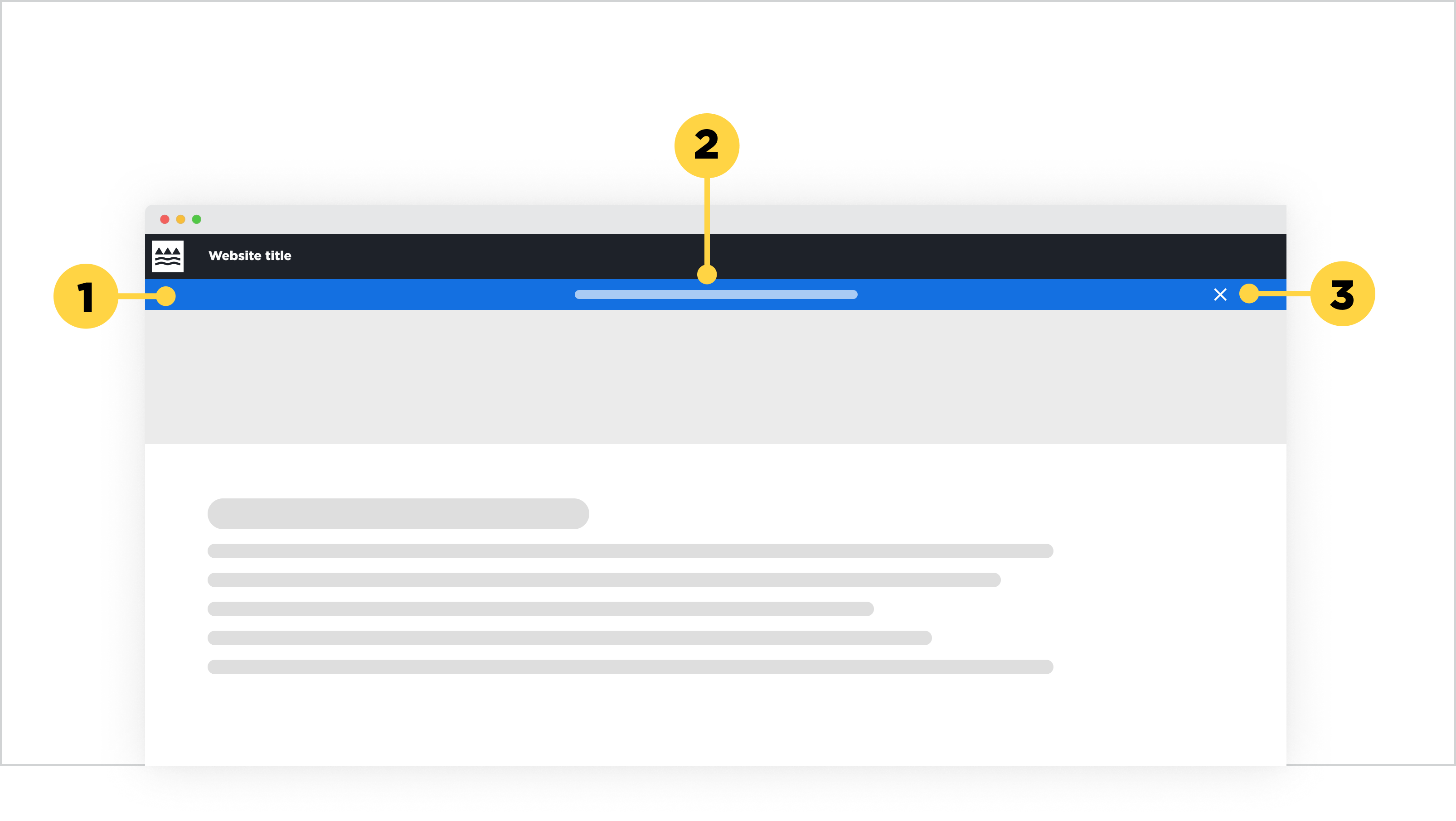
1. Banner container with the Design system's Interactive blue colour
2. Message centered inside the banner
3. Cancel icon (optional) if the banner allows the user to collapse the element
Main elements
Alert message
- The message should be brief, clear and descriptive. It should only be a short sentence, and never a paragraph.
- It can be a static message or can link to an internal or external page.
Cancel icon
- This icon enables users to collapse the banner. This should only be applied if the information inside the alert banner is crucial to be seen by the user, but does not sit high in the importance of hierarchy (e.g. a critical error, a deadline message).
Alignment
The alert banner by default honours the left/right margin that is set for each breakpoint. If the banner includes a cancel icon, it will align to the right-hand margin of the page. Usually the message is centered on desktop breakpoints, and left-aligned on mobile breakpoints. However, if the centering of text does not work on desktop because a different layout structure was chosen, then choose a left-alignment to honour the left to right reading behaviour most of our users have. This left-alignment should line up with the desktop left margin, which means it will align with the site title in the header and the body content on the page.
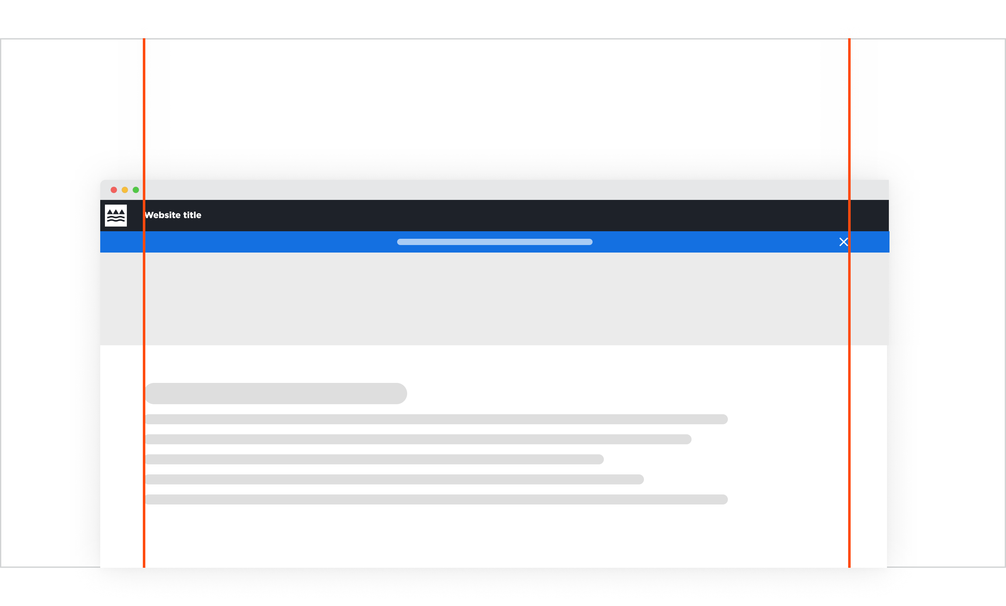
Alert banner with centered messaging.
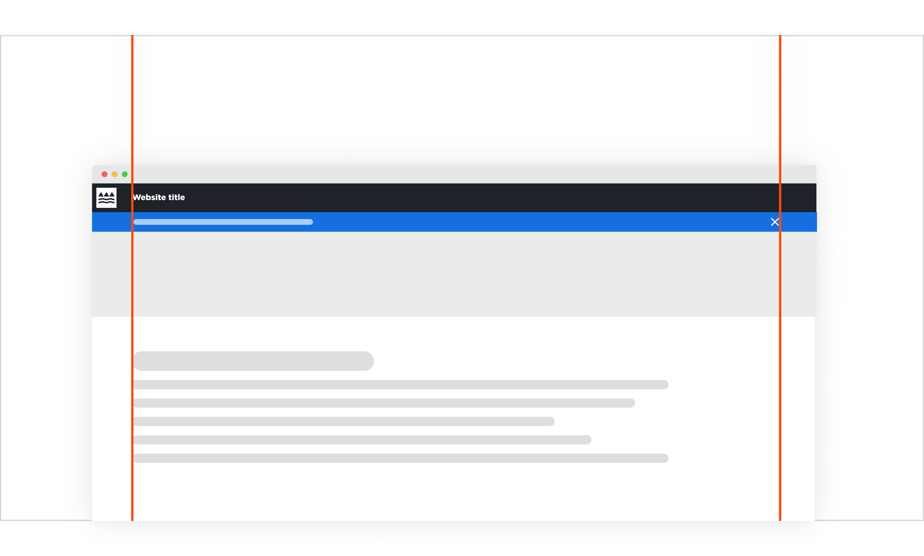
Alert banner with left-aligned messaging.
Behaviour
Default
The alert banner in its static behaviour, sits at the top of the page without any motion or animations.
Hover
On hover, the alert banner messaging receives an underline (just like our text buttons) and the cursor changes into a click cursor. If a cancel button is available, it does not have any specific visual hover effects apart from the cursor indicating it's clickability.
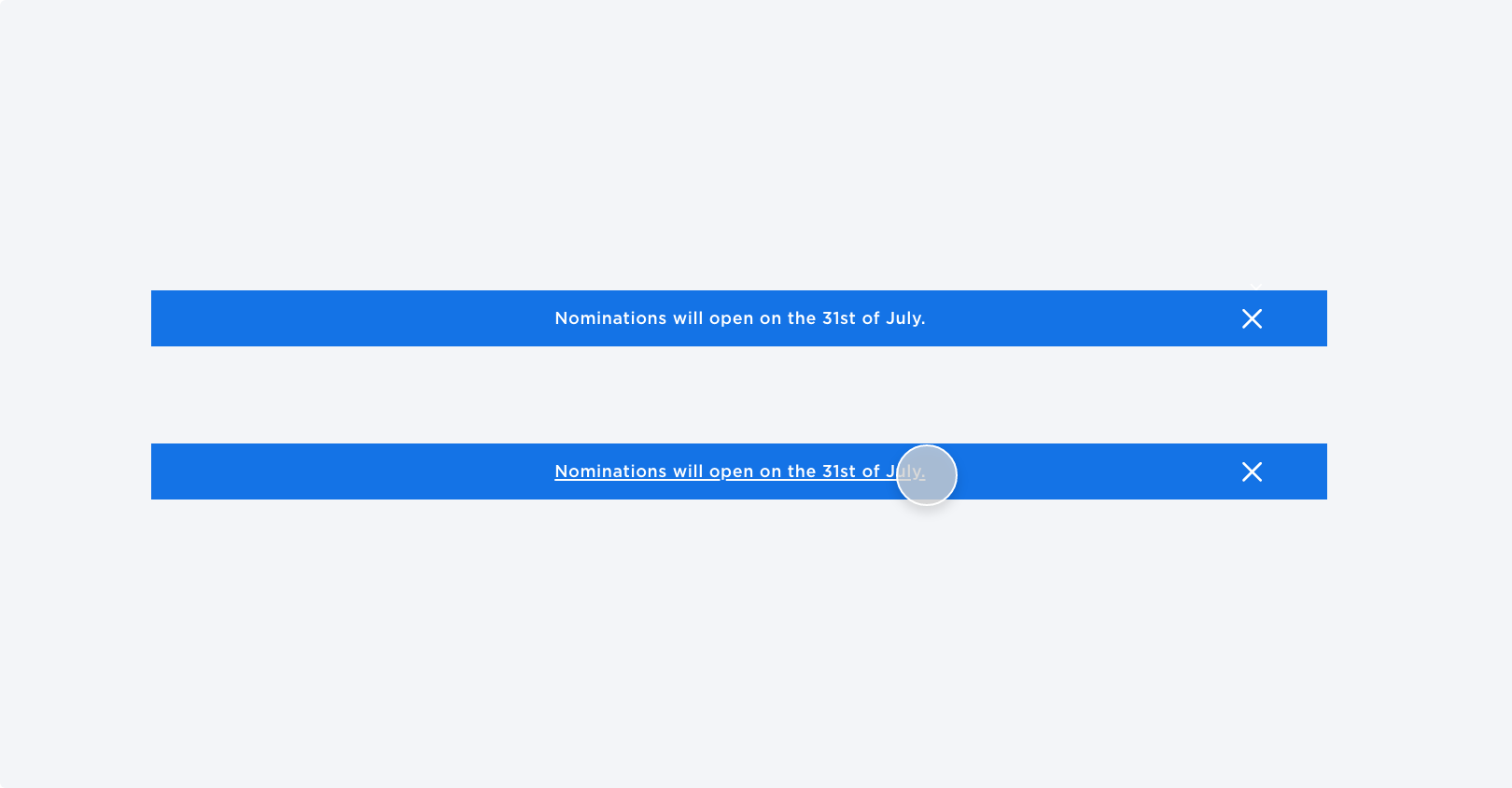
Top: Default state
Bottom: Hover state
Placement
In-Page Placement
Alert banners are solely placed within main page content, usually directly under header and above the page banner.
If the banner is collapsable through the cancel button, the page banner snaps directly underneath the header to avoid the appearance of a gap that appears after the banner disappears.
Grid Placement
When placing an alert banner on the 12 Column Grid, the alert message should either align in the centre of the grid or align to the very first, left column so that it alignes with the logo typeface. If a cancel icon is applicable, it should align to the last, far right column in the grid.
Iconography
This component is dedicated to alerting of users to important changes. In most cases an icon will not be required, however if the banner needs to be collapsable, we are using the cancel icon to indicate such behaviour to the user.
Alert banner zoomed in with and without a cancel icon
When to use this component
Use this component if all of the following conditions are met:
- If the urgent information that needs to be presented is temporary
- The user is most likely going to need this information under time pressure
When to consider a different solution:
Don't use an alert banner if:
- There are multiple "important messages". Stacking alert banners reduces the impact of the messaging being perceived as 'urgent'.
- Your only goal is to raise information hierarchy.