A breadcrumb shows the user their position in a navigation hierarchy and enables them to navigate upwards to parent pages. The breadcrumb is always a small component and should never entirely replace primary navigation.
Often with our deep hierarchies and many levels of content, it is preferable to truncate the breadcrumb as a space-saving measure. On desktop devices the breadcrumb should never wrap on to more than one line.
Anatomy
A breadcrumb can contain a divider to show the relationship between sections, this can be formatted as an icon or text. Our preferred default font-size is 15px.
Depending on the length of the page names, our preference is that breadcrumb trails should not include the current page. For example:
/grandparent / parent /
If a page doesn’t have a title or the current page is not clear to users, it can be included in the breadcrumb trail. If the current page is included in a breadcrumb it is not an interactive link.

- Home link
- Separator
- Page link w/ hover state activated
Alignment
Breadcrumbs always left-align, usually in relation to the nearest content element like a title heading.
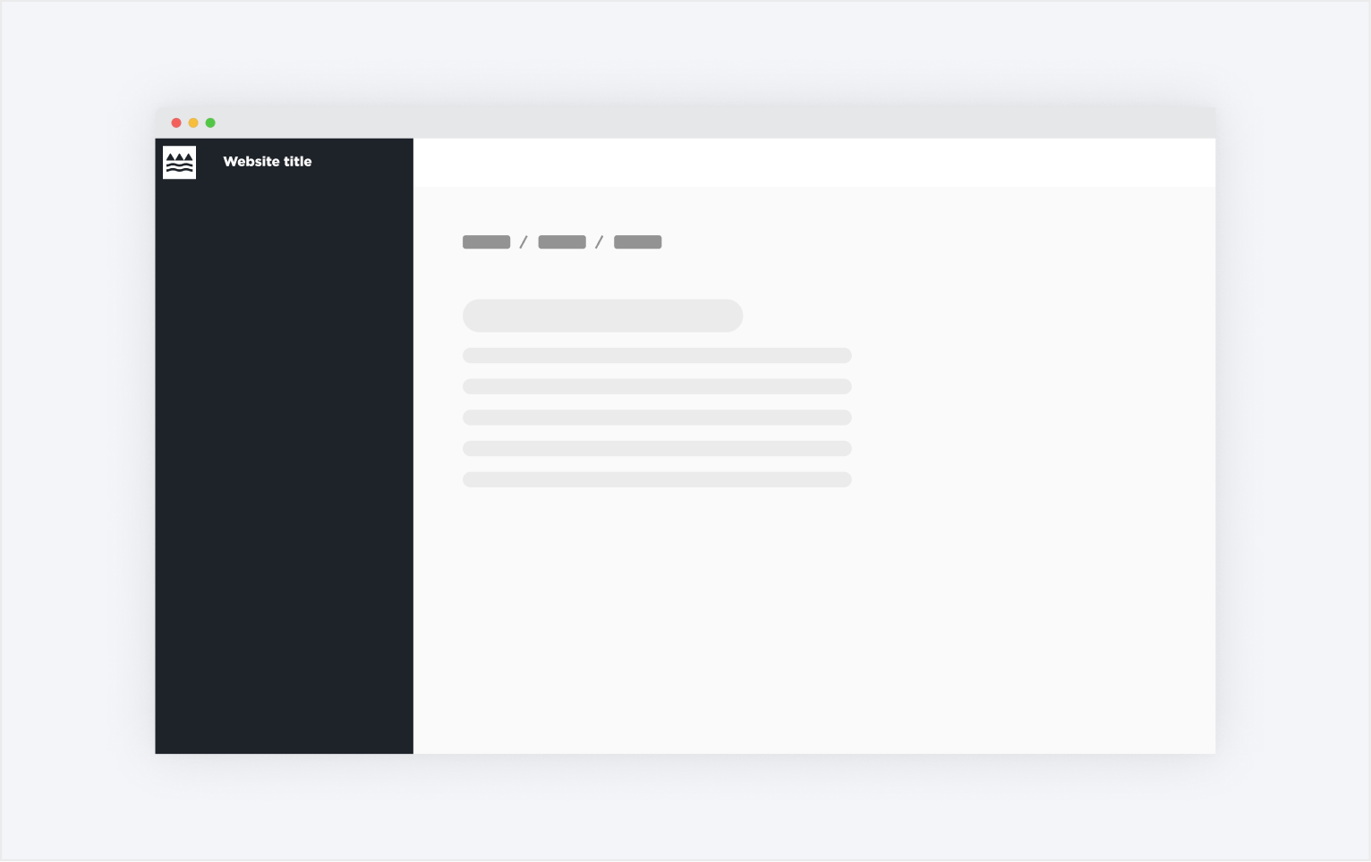
Breadcrumbs always align to the content inside the banner as well to the Ministry's logo typeface. If the page contains a sidebar, it will align to the closest type of content, which is usually the page title heading.
States
Because breadcrumbs are made out of a series of text links, there are two states to consider: default and active.
Default states are reserved to pages that the user is currently visiting or if the site doesn't have a direct page the user can go to.
Active states are used when the user can move to a specific page. Parent pages within the navigation hierarchy and the home page usually fall into this category.

The pages that link to a parent page (e.g. Home) are clickable and should be visibly indicated with an active state. The ones that can't be interacted with should stay in their default state (e.g. Registration).

Active breadcrumbs also receive a hover state to ensure the user knows they can click on them. This style is inherited from our text button design.
Interactions
The user can only interact with the active breadcrumbs, which usually link to the home page and/or the parent pages.
Placement
In-Page Placement
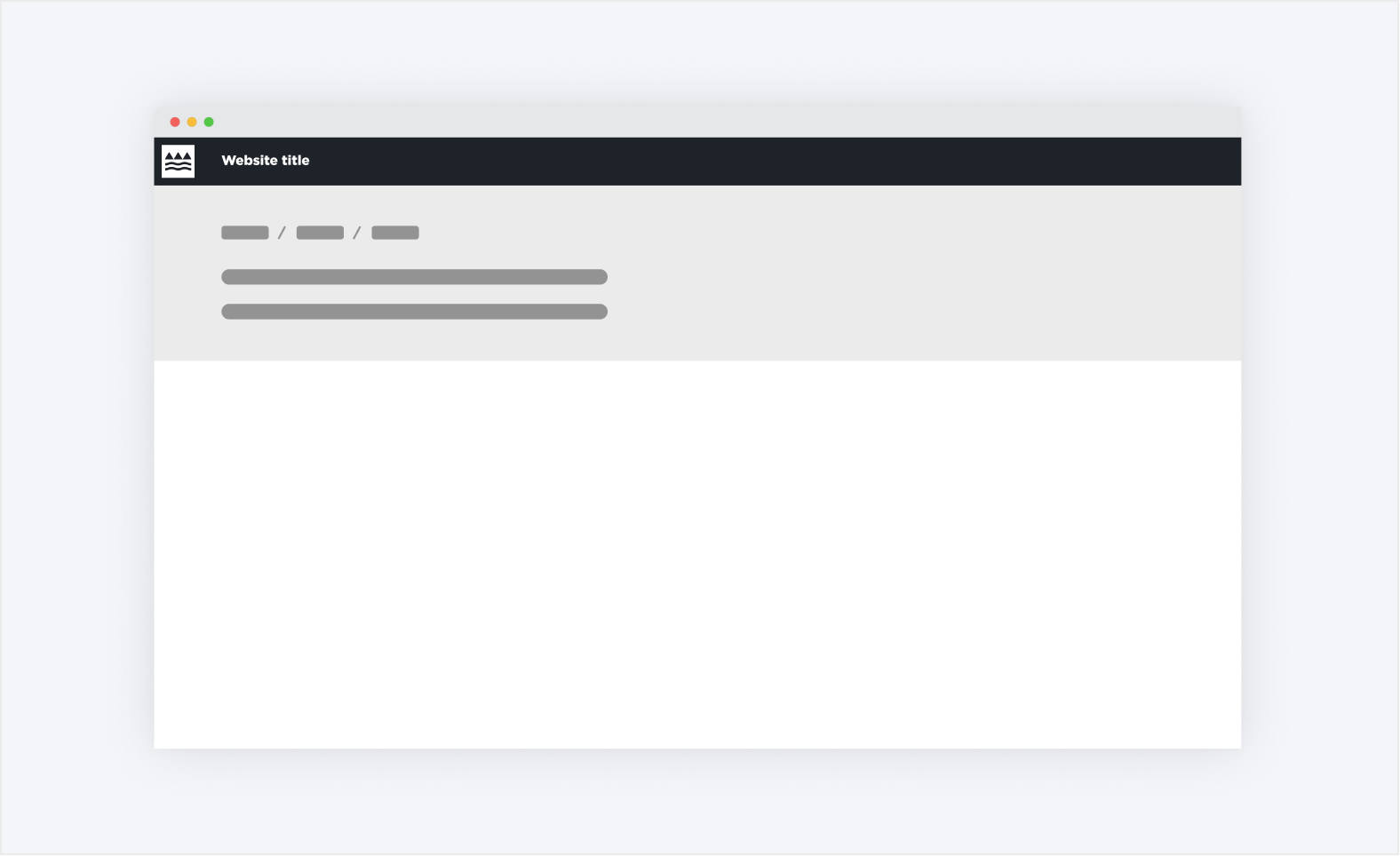
Breadcrumbs sit in the top left area of the page, usually underneath the header but above the title heading.
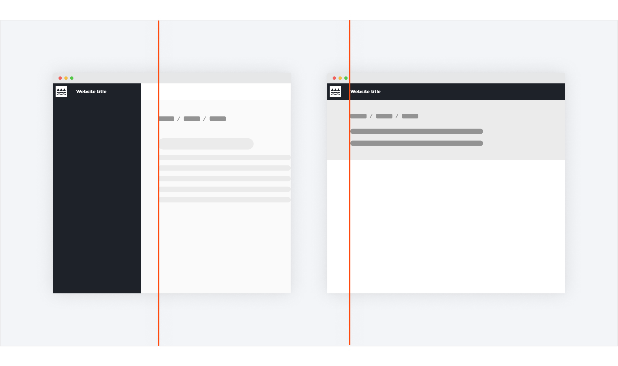
Breadcrumb is shown inside a hero banner. They are left-aligned to the title and line up nicely with the Ministry's logo typeface.
Breadcrumb shown inside content page with a sidebar. They are left-aligned to the page title.
Iconography
The chevron and diagonal line separator are used to clearly distinguish between the different page links. The home icon provides an alternative to the page link, especially in cases of extensive page links. It enables us to save a bit more space on the page.

Best Practice
When to use this component
- Information architecture goes more than two levels deep into the content hierarchy
- Keeps the user informed where they are currently in the navigation hierarchy without taking up too much space on the page.
When to consider a different component
- If you need to indicate progress throughout a sequence (e.g. on a form).
- Using them on products with single-level navigation creates unnecessary clutter.
Usability
Consider an alternative to wrapping. The longer the page titles are displayed in a breadcrumb, the more likely they will wrap (especially on mobile devices). Consider either truncating the title or choosing a shortened name for the page.
Always start with the page highest in the hierarchy. This way the user will be able to understand the relationship and pathway of navigation of the pages better.
Don't make the width of the breadcrumbs too small. Consider the width of the breadcrumbs to ensure users can interact with them even on smaller devices.
Accessibility
- Use semantic HTML to ensure that the component is properly interpreted by assistive technology.
- Provide clear and concise labels for each breadcrumb item that accurately represent the page or location.
- Use keyboard accessibility to allow users to navigate the breadcrumb with the keyboard.