The tool tip component is a small UI component that provides additional information about an element when the user hovers over it. It is commonly used to provide context or explain functionality.
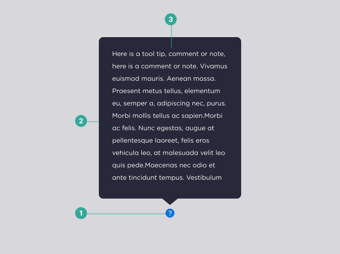
Anatomy
The tool tip component consists of the following elements:
- Trigger Element: The element that the user interacts with to trigger the tool tip.
- Tool Tip Container: The container that holds the tool tip content.
- Tool Tip Content: The content that provides additional information about the trigger element.
States
The tool tip component has two states:
Active: When the tool tip is currently visible.
Inactive: When the tool tip is not currently visible.
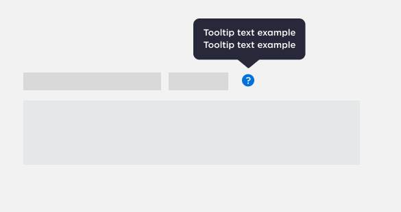

Example of both states of the tooltip component. Active (left) and inactive (right).
Best Practices
Here are some best practices to keep in mind when designing with the tool tip component:
Do:
- Keep tool tip content brief and to the point.
- Use clear and concise language in the tool tip content.
Don't:
- Use tool tips to display critical information. Tool tips are best suited for non-essential or supplementary information.
- Make the tool tip too small or difficult to read.
- Use tool tips as a replacement for proper UI labels or descriptions.
Accessibility Information
When designing with the tool tip component, it is important to ensure that it is accessible to all users. Here are some accessibility considerations to keep in mind:
- Ensure that the tool tip content is accessible to screen readers and other assistive technologies.
- Provide keyboard accessibility for triggering the tool tip.
- Ensure that the tool tip is not triggered unintentionally, as this can be disorienting for users with certain disabilities.